
Very Peri: Pantone Color of the Year 2022
Pantone introduced a new blue shade - PANTONE 17-3938 Very Peri, a dynamic periwinkle blue hue with a vivifying violet red undertone as the Pantone Color of the Year selection for 2022. Blending the faithfulness and constancy of blue with the energy and excitement of red, this happiest and warmest of all the blue hues introduces an empowering mix of newness.
Displaying a carefree confidence and a daring curiosity that animates our creative spirit, inquisitive and intriguing PANTONE 17-3938 Very Peri helps us to embrace this altered landscape of possibilities, opening us up to a new vision as we rewrite our lives. Rekindling gratitude for some of the qualities that blue represents complemented by a new perspective that resonates today, PANTONE 17-3938 Very Peri places the future ahead in a new light.
We are living in transformative times. PANTONE 17-3938 Very Peri is a symbol of the global zeitgeist of the moment and the transition we are going through. As we emerge from an intense period of isolation, our notions and standards are changing, and our physical and digital lives have merged in new ways. Digital design helps us to stretch the limits of reality, opening the door to a dynamic virtual world where we can explore and create new color possibilities. With trends in gaming, the expanding popularity of the metaverse and rising artistic community in the digital space PANTONE® 17-3938 Very Peri illustrates the fusion of modern life and how color trends in the digital world are being manifested in the physical world and vice versa.
“As we move into a world of unprecedented change, the selection of PANTONE 17-3938 Very Peri brings a novel perspective and vision of the trusted and beloved blue color family. Encompassing the qualities of the blues, yet at the same time possessing a violet-red undertone, PANTONE 17-3938 Very Peri displays a spritely, joyous attitude and dynamic presence that encourages courageous creativity and imaginative expression.”
Leatrice Eiseman, Executive Director at Pantone Color Institute
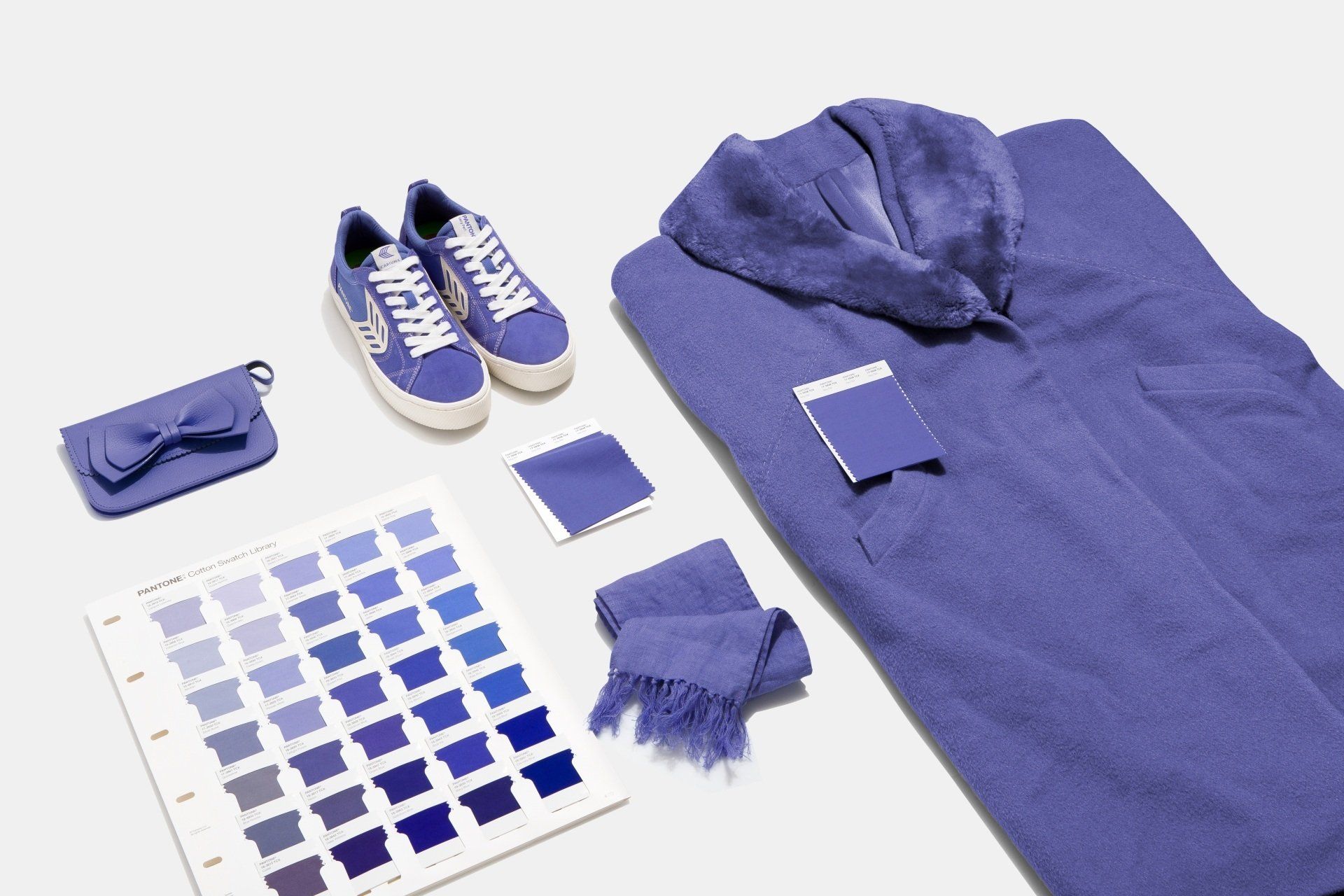
PANTONE® 17-3938 Very Peri in Apparel and Fashion Accessories
PANTONE 17-3938 Very Peri, a warm and friendly blue hue with a carefree confidence and joyful attitude, emboldens uninhibited expression and experimentation. Displaying a dynamic presence, Very Peri is an enthusiastic blue hue whose whimsicality lends itself to unpredictable color harmonies and spontaneous color statements. Futuristic in feeling, PANTONE 17-3938 Very Peri takes on distinct appearances through application to different materials, finishes and textures, from shimmery metallics, lustrous sheens and high-tech materials to handcrafted looks and natural fibers.
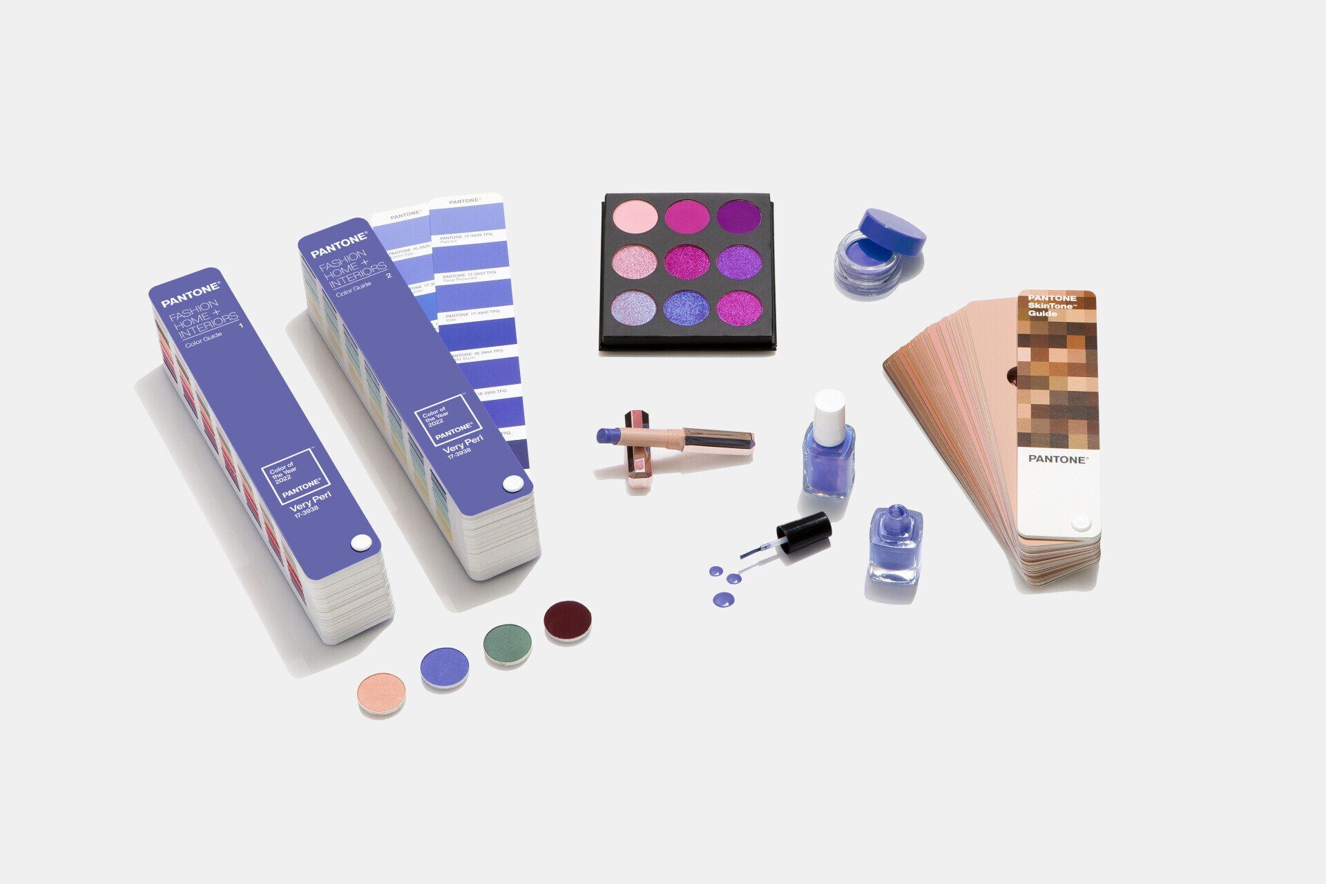
PANTONE® 17-3938 Very Peri in Beauty and Hair
Suggestive of personal inventiveness and daring imagination, PANTONE 17-3938 Very Peri makes a novel statement for eyes, nails and especially in hair in a variety of finishes and applications from glittery and glam to dusty matte.
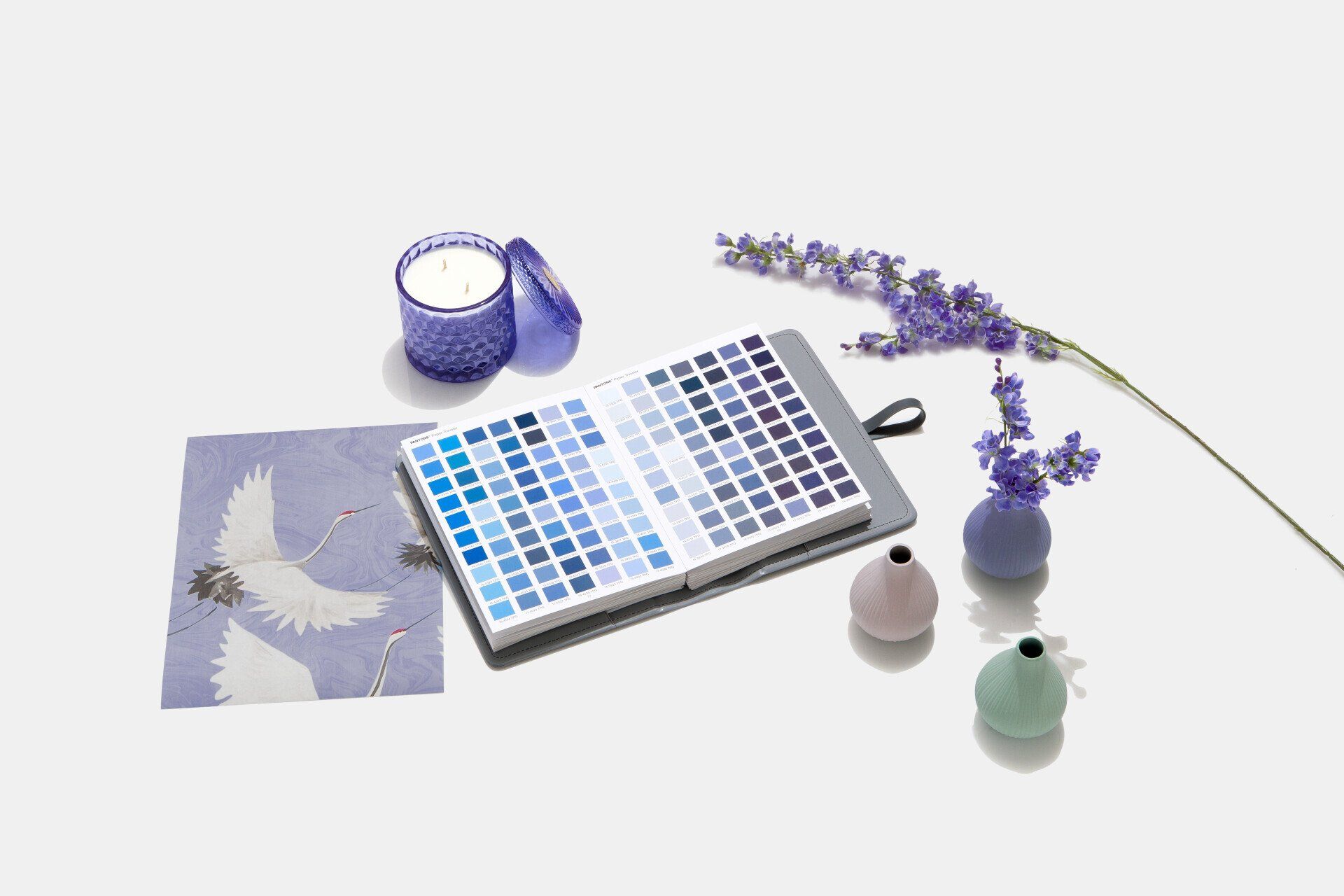
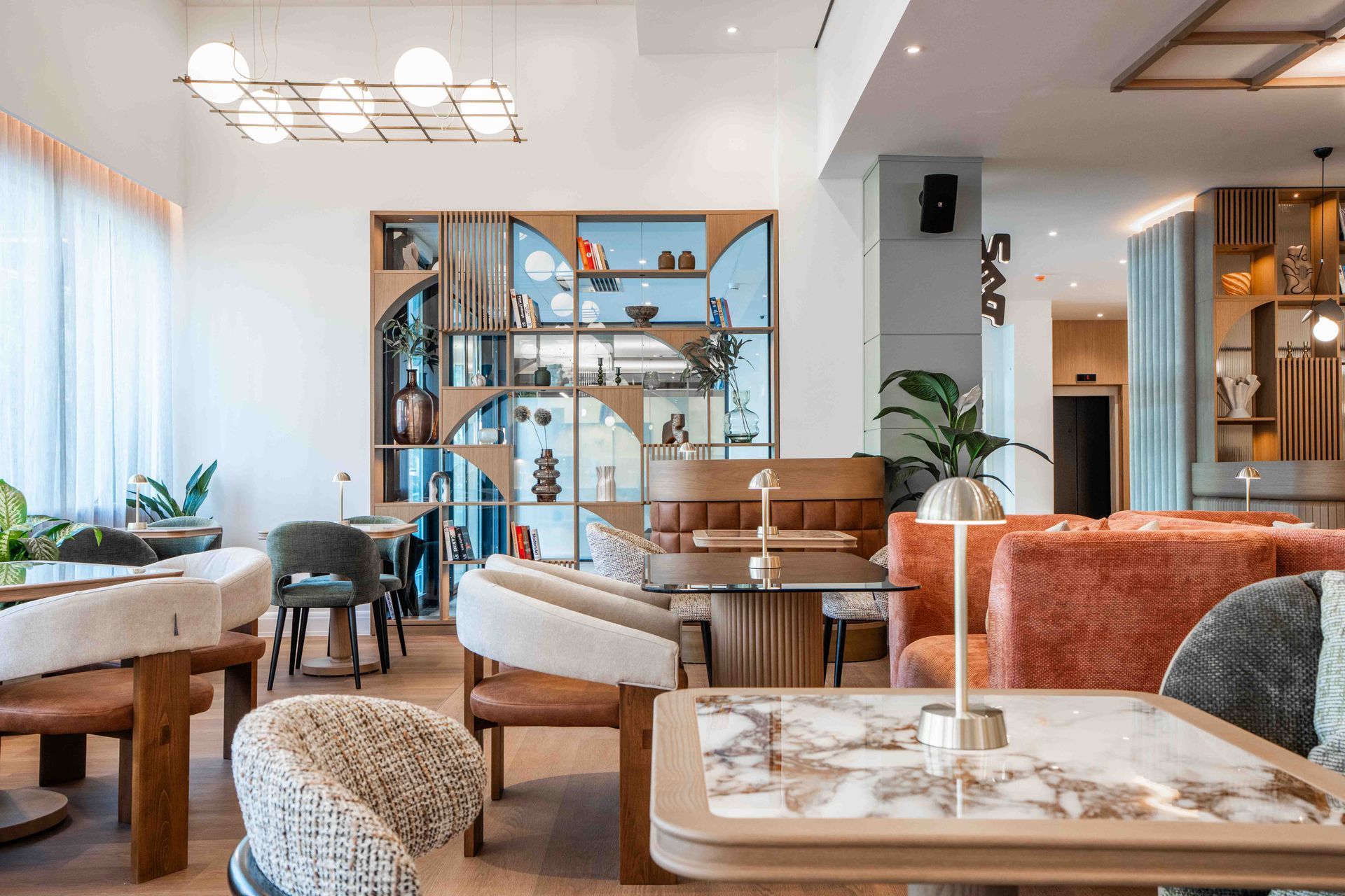
PANTONE® 17-3938 Very Peri in Home Décor and Interior Design
Evocative of new modernity, PANTONE 17-3938 Very Peri injects a sense of playful freshness into home interiors, enlivening a space through unusual color combinations. A versatile shade that animates our creative spirit, PANTONE 17-3938 Very Peri is suited to an array of different materials, textures and finishes, providing a pop of color, whether introduced through a painted wall, accent furniture or home décor, or acting as an intriguing and eye-catching accent in a pattern.
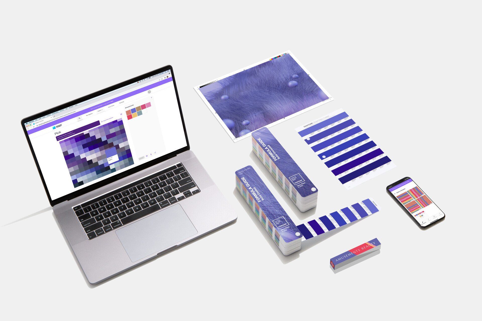
PANTONE® 17-3938 Very Peri in Packaging and Multimedia Design
Fusing together the undertones of the constancy and continuity of blue with the energy and excitement of red, PANTONE 17-3938 Very Peri, conveys a message of credibility as well as creativity. Whether appearing in a fantasy digital realm or in physical materials, PANTONE 17-3938 Very Peri exudes a good- natured warmth that quickly engages the eye, making it an ideal shade for many applications of graphic and multimedia design as well as packaging.
ABOUT PANTONE COLOR OF THE YEAR
The Pantone Color of the Year selection process requires thoughtful consideration and trend analysis. To arrive at the selection each year, Pantone’s color experts at the Pantone Color Institute™ comb the world looking for new color influences. These can include the entertainment industry and films in production, traveling art collections and new artists, fashion, all areas of design, popular travel destinations, as well as new lifestyles, playstyles, and socio-economic conditions. Influences may also stem from new technologies, materials, textures, and effects that impact color, relevant social media platforms and even upcoming sporting events that capture worldwide attention. For 23 years, Pantone’s Color of the Year has influenced product development and purchasing decisions in multiple industries, including fashion, home furnishings, and industrial design, as well as product packaging and graphic design.
ABOUT PANTONE COLOR INSTITUTE™
Pantone Color Institute is the business unit within Pantone that highlights the top seasonal runway colors, selects the Pantone Color of the Year, forecasts global color trends, and advises companies on color for product and brand visual identity. Through seasonal trend forecasts, color psychology, and color consulting, Pantone Color Institute partners with global brands to effectively leverage the power, psychology, and emotion of color in their design strategy.
SHARE THIS
Latest Edition
Mar / Apr 2026 edition is available now!
Contribute
G&G _ Magazine is always looking for the creative talents of stylists, designers, photographers and writers from around the globe.
Find us on
Latest News
Subscribe
Keep up to date with the latest trends!
Popular Posts