

A Glimpse into Interior Designer Adi Bergman Erel’s family home
Adi Bergman Erel created a dreamy family apartment that pays tribute to natural materials and resources such as natural daylight that washes the property through its many wide openings.
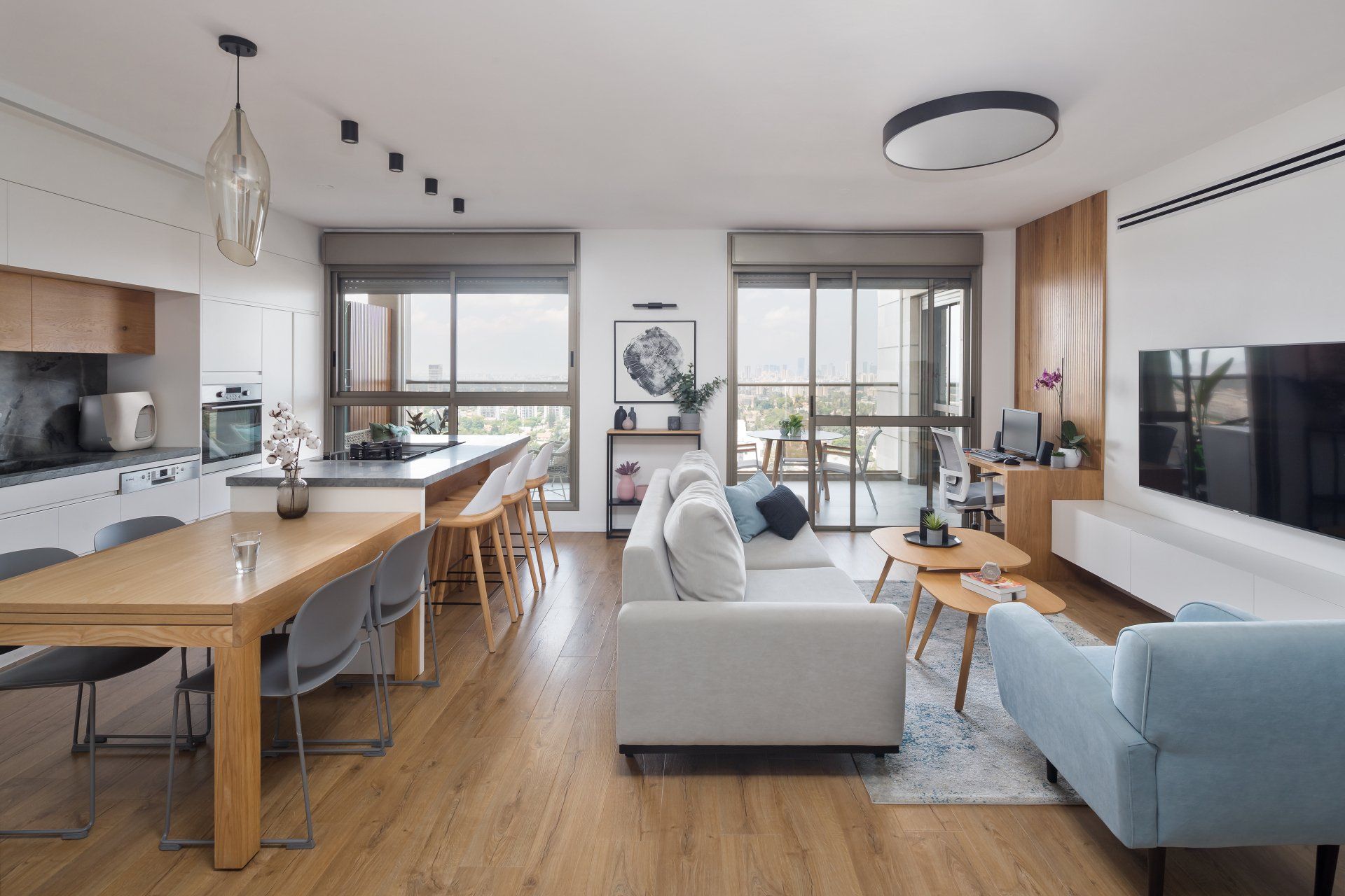
The apartment is home to the interior designer Adi Bergman Erel, her hi-tech professional husband and their two children aged 7 and 10. The apartment, located in a 12-year-old building, underwent a significant renovation. Thanks to the designer’s meticulous planning, considering each and every detail, the generic new-build property was turned into a cozy home that perfectly satisfies the family’s needs,
"In hindsight, I can say that the planning and renovation of my private property, in which I was naturally emotionally attached to, was a challenging process. However, we are all thrilled with the outcome”.
Adil Bergman Erel
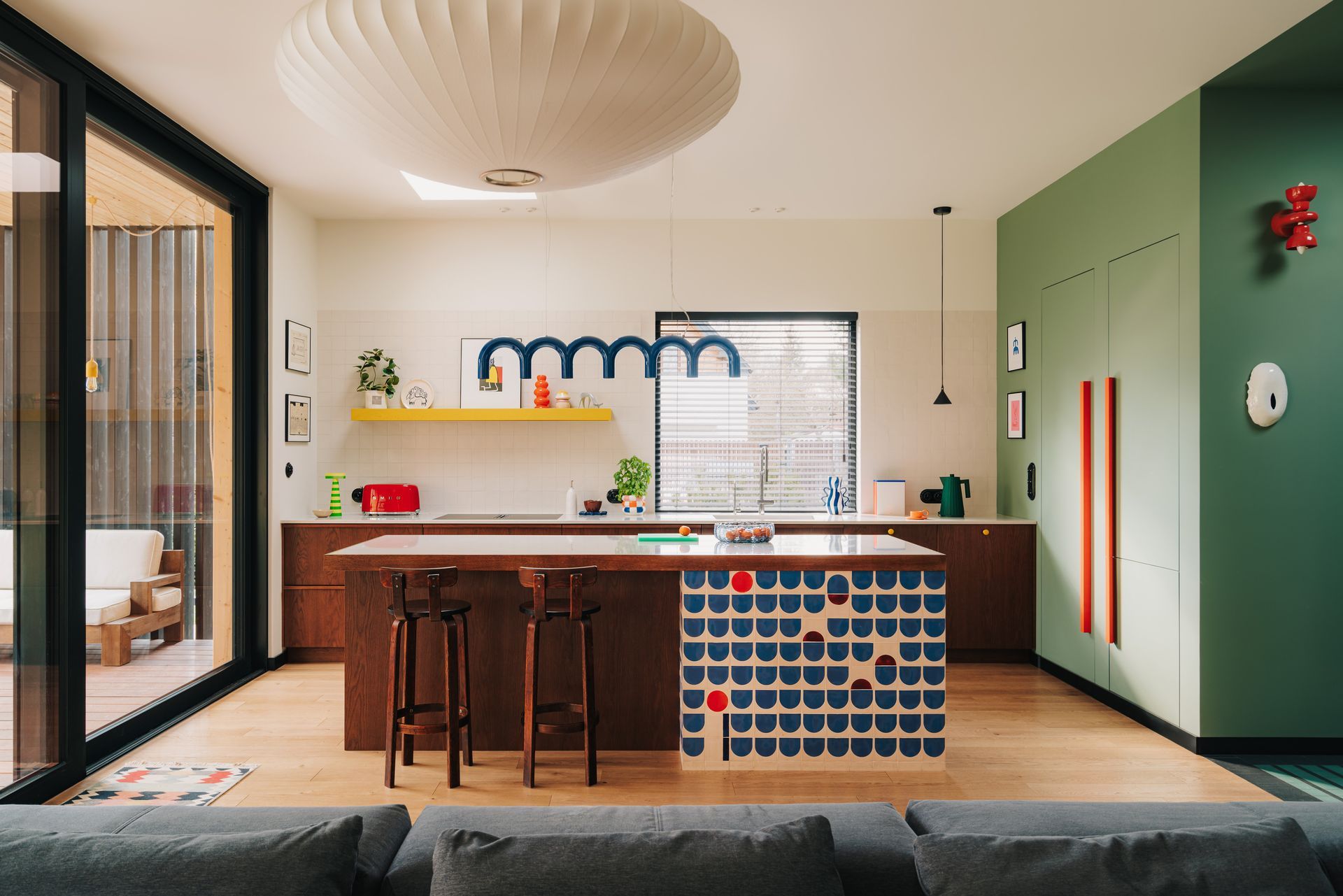
The planning process took approximately a month. The renovation, which lasted an additional couple of months, included changes to the floor plan and replacing the entire infrastructure. There were many changes, the most notable being the underutilized storage room that the designer repurposed as a home office for her husband. The office naturally extends from the living room and is an integral part of its design. The use of Belgian profile and transparent doors visually increased the size of the open living space.
The designer started the project with a limited budget. The initial intention was to upgrade the kitchen and replace the furniture in the home office corners. However, a week before the works started, the couple decided to renovate the bathrooms too, which increased the project costs by several thousands of dollars, and doubled the duration of the project - from one month to two.
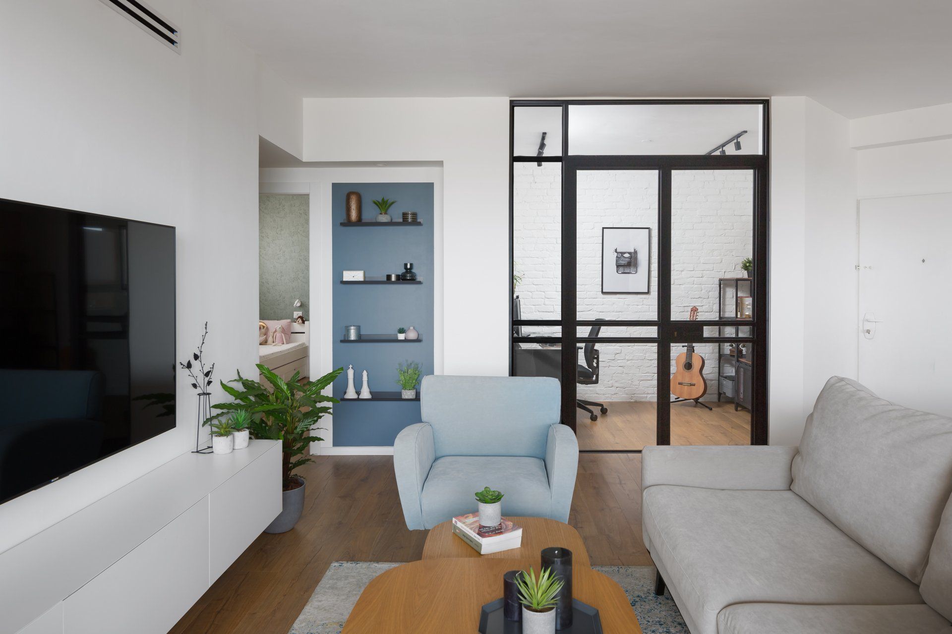
"Whilst my husband’s prime focus was to have a quiet and functional home office, it was important that this new space would blend in harmoniously with the rest of the family space."
The designer created a light-colored brick wall that gives a ‘loft’ feel, a large and comfortable English desk, and a soft and calming color scheme that blends with that of the living room and kitchen. In addition, she upgraded the lighting so that the space will look professional for Zoom meetings.
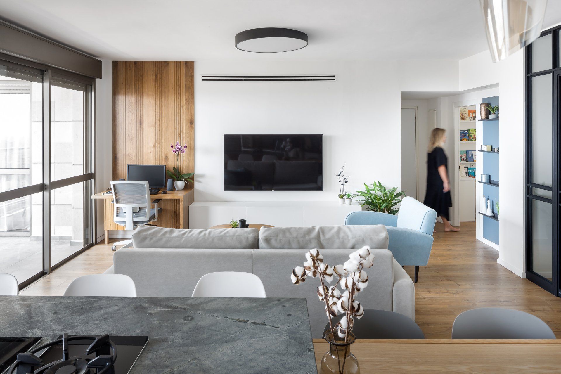
While the designer’s workstation is located in the living room and blends in with the overall design: the workstation corner is used as a sort of power wall. She created wood panel cladding that visually creates a sense of immense height (even though it only stands at 2.65m) and a storage space with a similar facade under the desk, where I store all my folders and tech equipment.
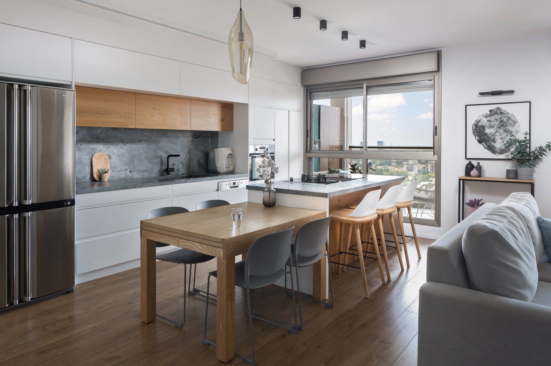
The original “cookie-cutter” kitchen was replaced with a practical parallel kitchen space that enables interaction with all the open spaces around it. The kitchen was also fitted with a large window that overlooks a well-kept balcony, creating a sense of continuous space and used as a serving window for outdoor meals. Prior to the renovation, insufficient kitchen storage was a real challenge, and the dining table was mostly used as a work desk and rarely as a place for family meals. The new plan turned the kitchen into a much more practical space - the cupboards almost reach the ceiling, and a multi-functional kitchen island was fitted for the use of the family as well as entertaining - allowing us to cook whilst holding conversations with family and guests.
“A kitchen island was one of my dreams before we started the renovation. I knew I wanted an island with a stovetop so that I could face the open space whilst cooking. Having a kitchen island also enabled me to create additional and much-needed storage.”
In addition, the designer created a large and easy-to-use worktop and used small kitchen appliances to ensure the space was as clutter-free as possible. I designed a standard-height dining table that continues the island and as a family, we really enjoy this seating arrangement. The dining table is portable, and we can change its location when we entertain, which is practical and convenient.
Bergman Erel chose a timeless classic neutral white for the kitchen facade, with the view that should she ever wish to redecorate the space, she could do this with inexpensive objects and elements. The designer chose a gray granite worktop that was considerably pricier than other suitable alternatives. In order to stay within the project budget, she chose aesthetic yet reasonably priced doors. The combination between the light facades and the gray granite worktop does justice to the entire space. Not only does it look fantastic, but it is also a timeless combination and will serve us for many years to come.
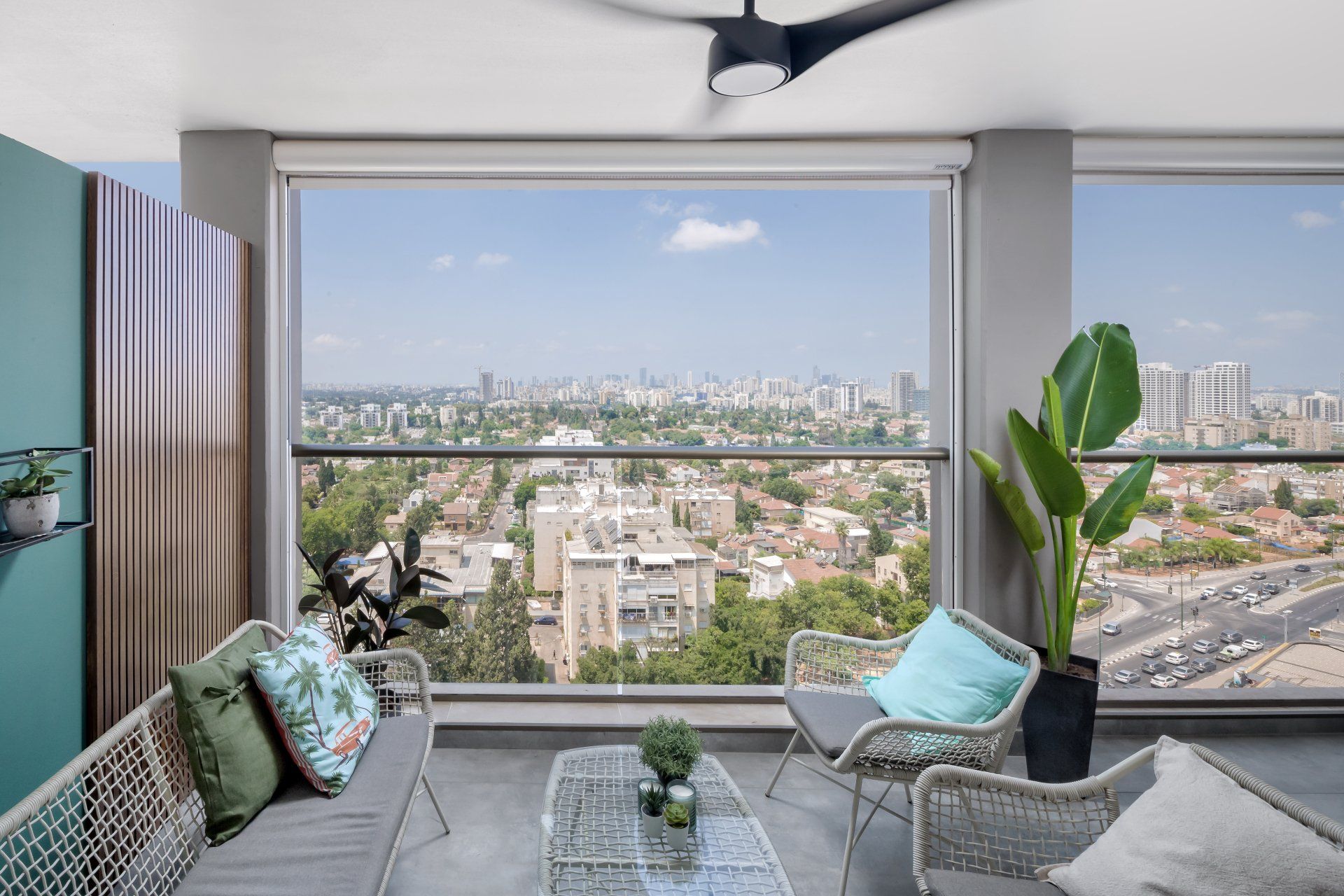
Although the family didn't use the balcony often, prior to the renovation, Bergman Erel chose to invest in it, and in hindsight, it was the right decision. She used wooden elements in the balcony wall that correspond with those in my workstation. They provide an illusion of height and dimension and create a subtle element of continuity between the interior and exterior.
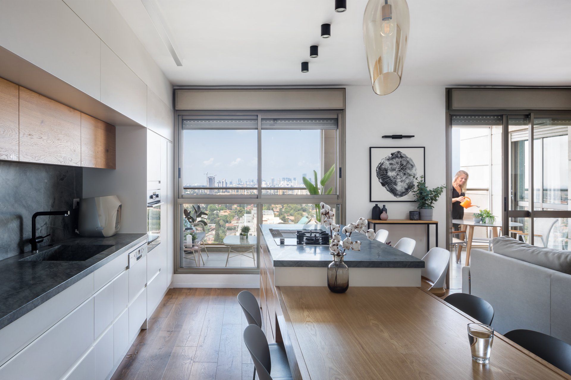
“Since none of us have ‘green thumbs’, we chose low-maintenance plants that upgrade the space and contribute to its homey feel. Special light fixtures were fitted for soft almost magical lighting during night hours.”
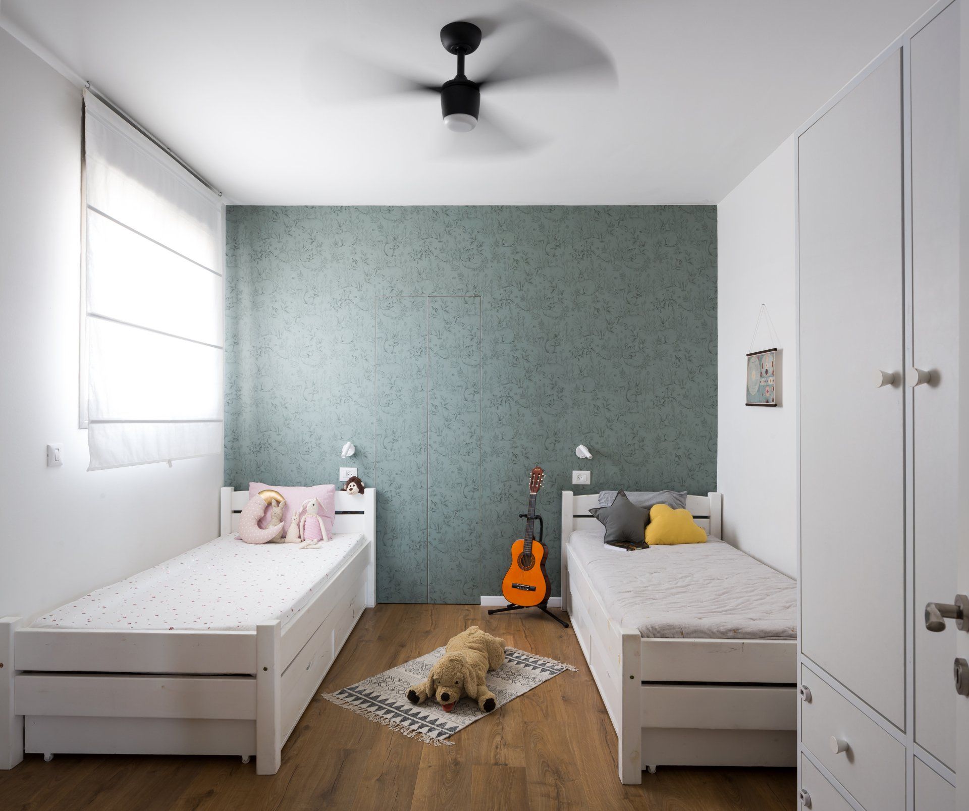
The designer put an emphasis on upgrading the children’s bedrooms where she faced the challenge of asymmetric built-in wardrobe doors that she couldn't remove. She created a hidden cupboard with the use of smokey hued unisex wallpaper. This gives the space an elegant and mature feel, whilst also concealing the doors that lead to the wardrobe.
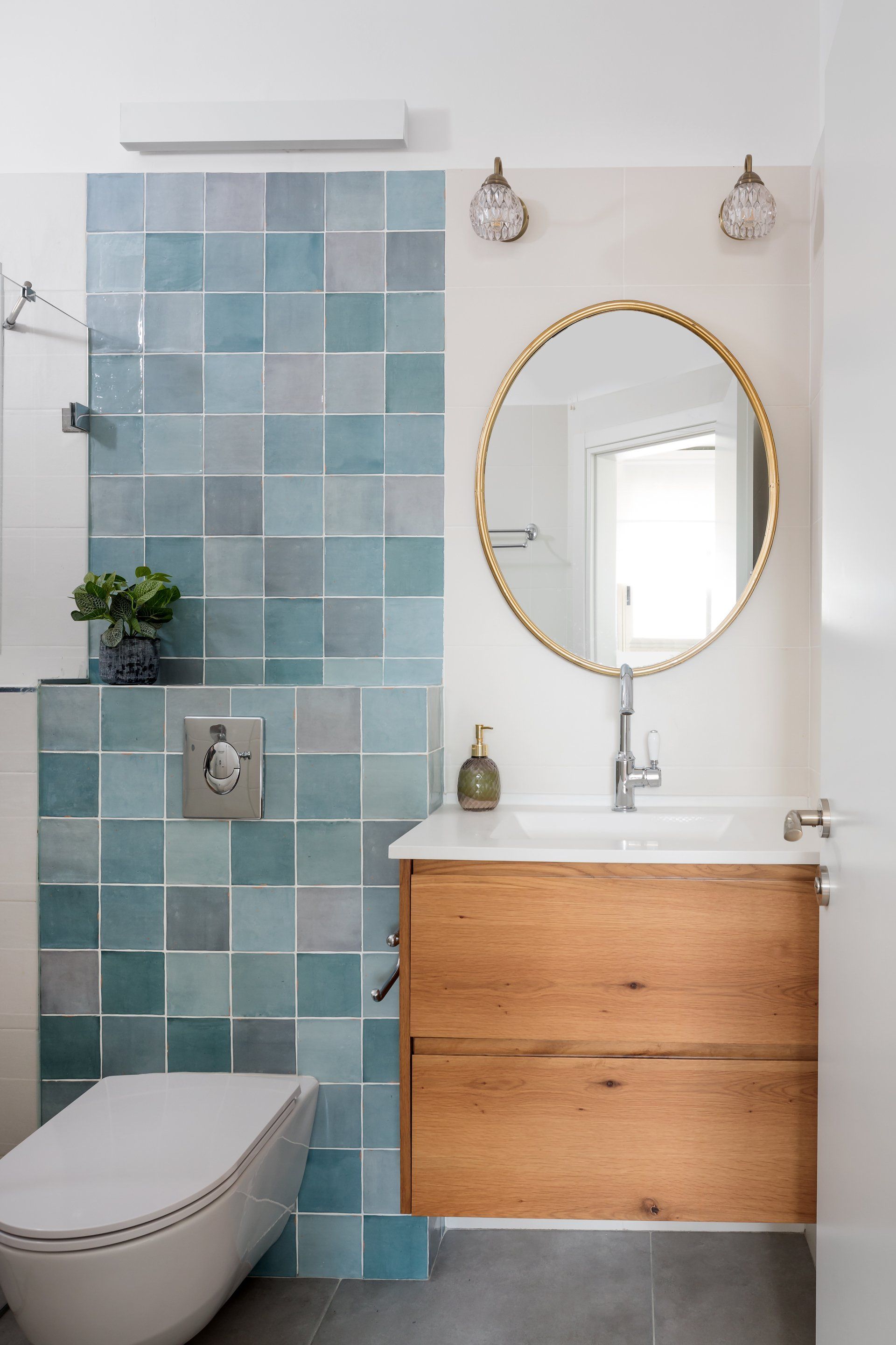
The original bathrooms were gutted, and their infrastructure was refitted according to the new plans. In many new builds, there is a tendency to position the utility corner next to the windows, and so the washing machine ends up enjoying the most important space in the bathroom. She decided to change the hierarchy and planned the actual bathroom in this space so that we could enjoy the window. The previous small and impractical bath was replaced with a spacious shower with an inbuilt niche for bath products. The new 165/80cm shower is not only more convenient but also safer, and although it is not particularly big, the designer managed to create a pampering spa vibe that makes the use of the space very enjoyable.

Photography
Shai Epstein
Interior Design
Adi Bergman Erel
SHARE THIS
Contribute
G&G _ Magazine is always looking for the creative talents of stylists, designers, photographers and writers from around the globe.
Find us on
Latest News


Subscribe
Keep up to date with the latest trends!
Popular Posts