
Otto’s Burger
April 10, 2020
Commissioned to design the latest edition to Otto’s Burger in the historic heart of Cologne, Studio Modijefsky has taken the history of the building as an inspiration for the new interior.
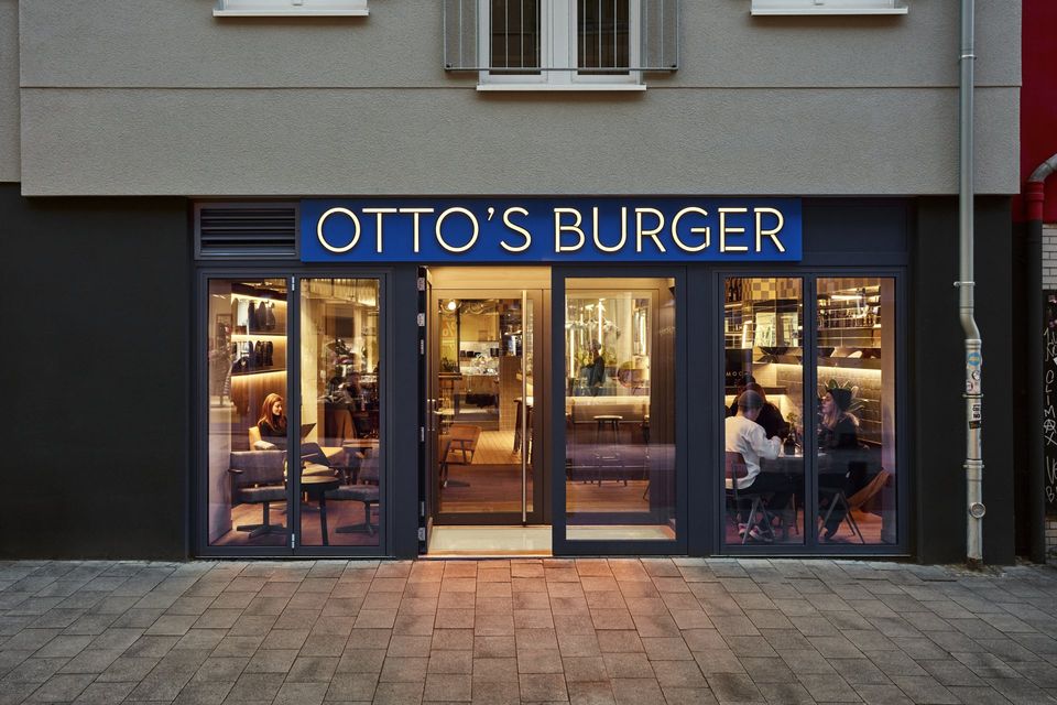
Formerly a bakery, the shop was characterized by two distinctive features that influenced the new design: the clear functional division of the space, and the traces of time visible within the tiled interior. Covering an L-shaped plot, this new burger restaurant is wrapped around a corner building.
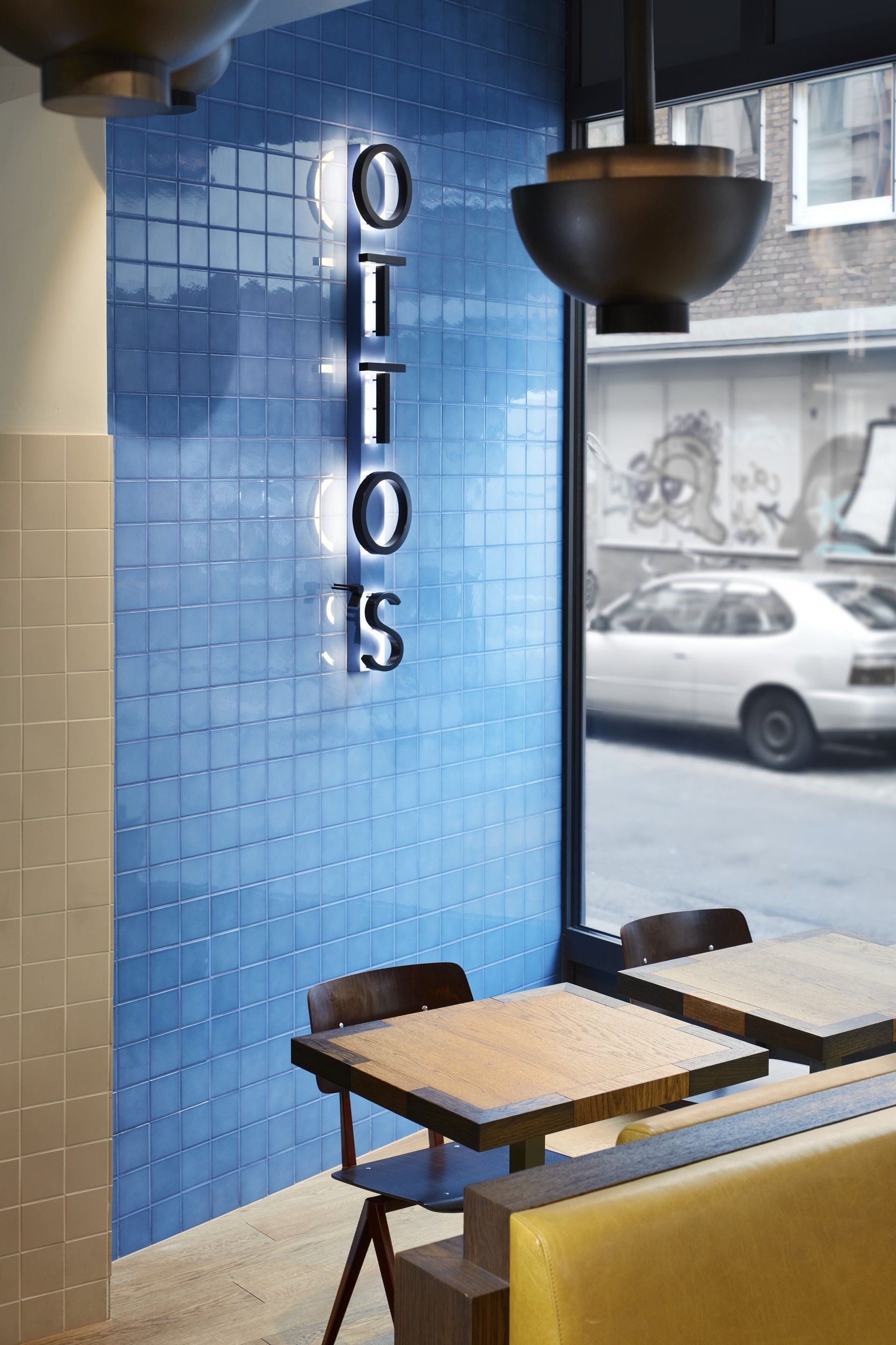
The link with the past is already visible within the façade: blue tiles inspired by the old interior embrace the entrance and visually connect with Otto’s logo. The lettering, built of simple shapes and profiles, connects the outside with the inside, where the space is unified by the same design language.

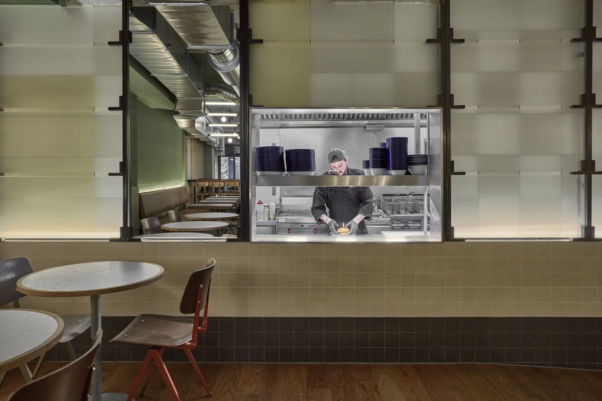
On one side, the area that was an old bakery shop became the main entrance, positioned on Severinstrasse, an old, busy street that connects the city from north to south; on the other, the area once used as a storage for the bakery, opens on a quiet side street. In the back of the corner building, where the two spaces meet, there is now a kitchen that connects both sides of the restaurant.

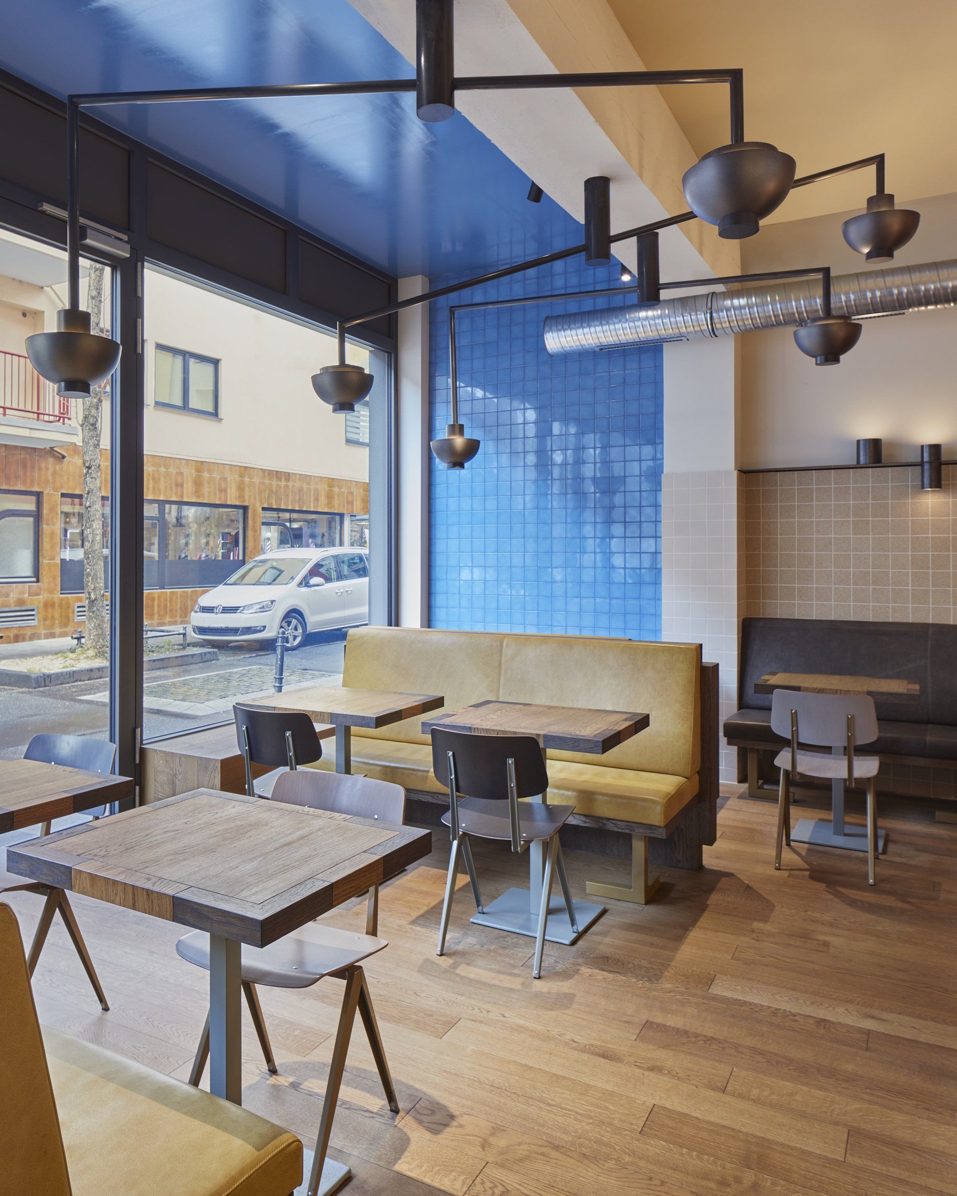
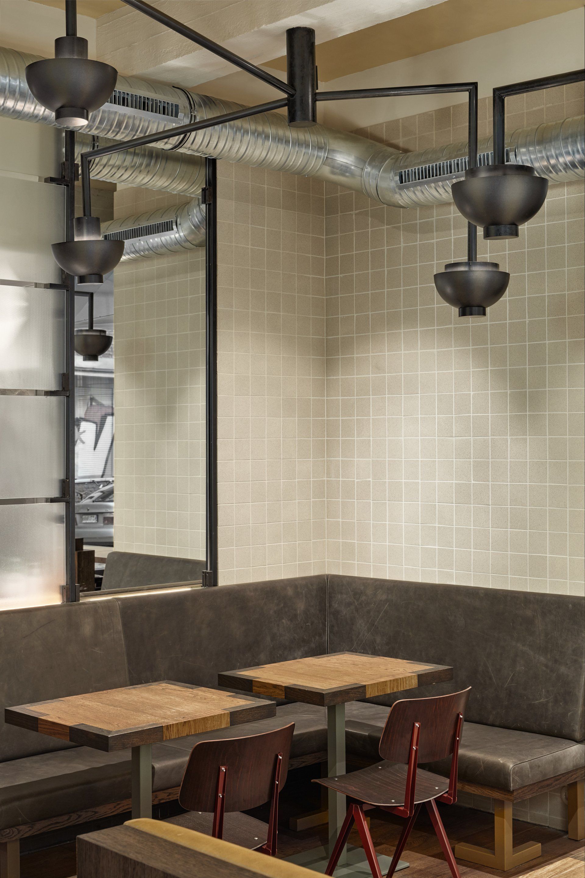
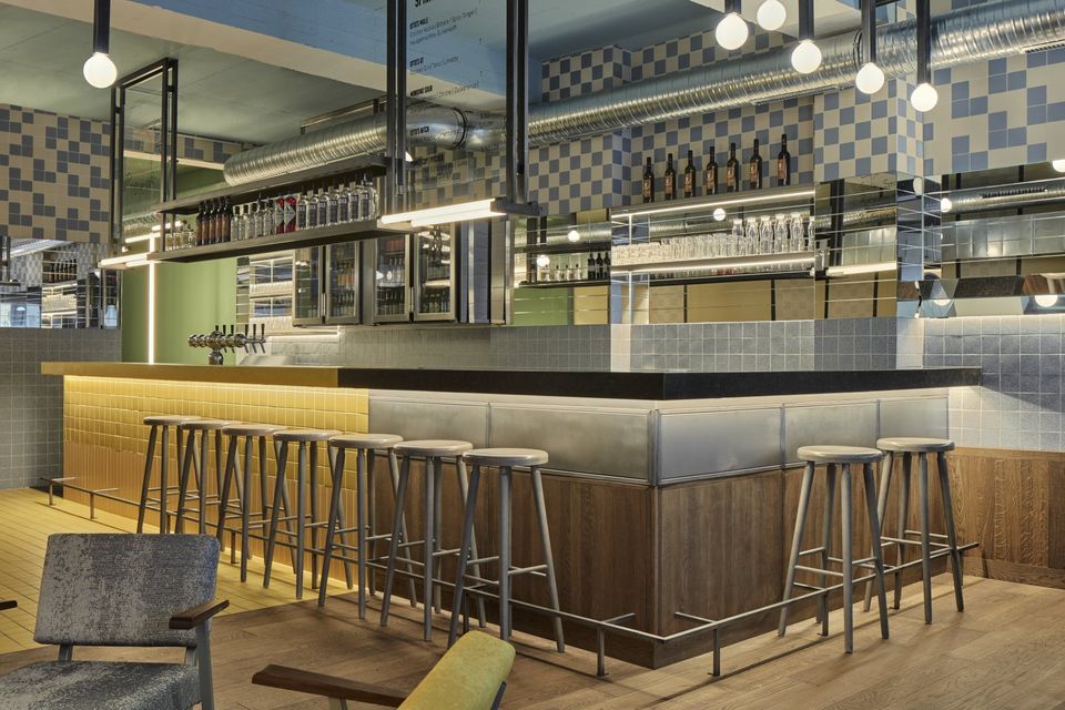
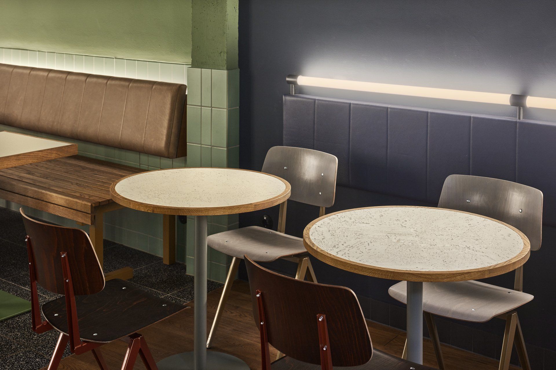
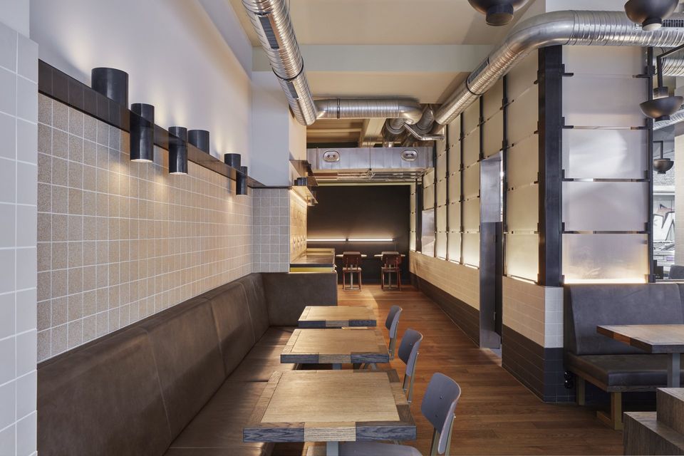
When walking into the building from the main street, a layered and inviting environment unfolds. Wood runs on the floor and climbs up on the bar and walls, giving a sense of warmth. Above the wood, a set of tiles, laid in the original pattern used from the bakery, pays homage to the history of the space. Speckled tiles and horizontal mirror slabs on the wall extend towards the center of the restaurant, inviting the visitor to walk further. Halfway down the bar a sudden change in the floor is visible: exactly where the owners of the old bakery had re-tiled the floor there are now yellow tiles. These, just like the wood, continue on the bar and visually extend on the yellow concrete counter, giving the space a strong accent point. Hanging from the ceiling, and inspired by the letter T in Otto’s, is a light element which also functions as a menu display and glass rack. Its steel and glass components, inspired by the vitrine of the bakery, create the perfect background to sit and enjoy a drink.
Above the head a stair-shaped tube lamp hanging from the ceiling indicates where the old staircase was located, while, under the feet, the new terrazzo floor unfolds leading the way towards the basement, where the old baking oven used to be. The railing, inspired by the language of the logo, dissolves within the darker-growing colors of the basement, seemingly taking the visitor inside the dark, flaming mouth of the bakery’s oven. Continuing further from the patio, walking towards the kitchen, the atmosphere changes: the warmth of the wooden floor softens the space, the long sitting areas encircling the kitchen give a sense of home and the beige tones of the tiles remind us of the flour and water used to make the bread. The area that was once used as a storage space for the old bakery becomes the source of inspiration for the decorations: the lights hanging from the ceiling are a reminder of the traditional bullion scales; the shelves running along the wall hold what looks like scale weights; the frame around the kitchen glass resembles the bakery tray rack. When looking at the furniture it is possible to see the flexibility of Otto’s language, which is transformed to create half-T shaped legs for the benches of the restaurant.
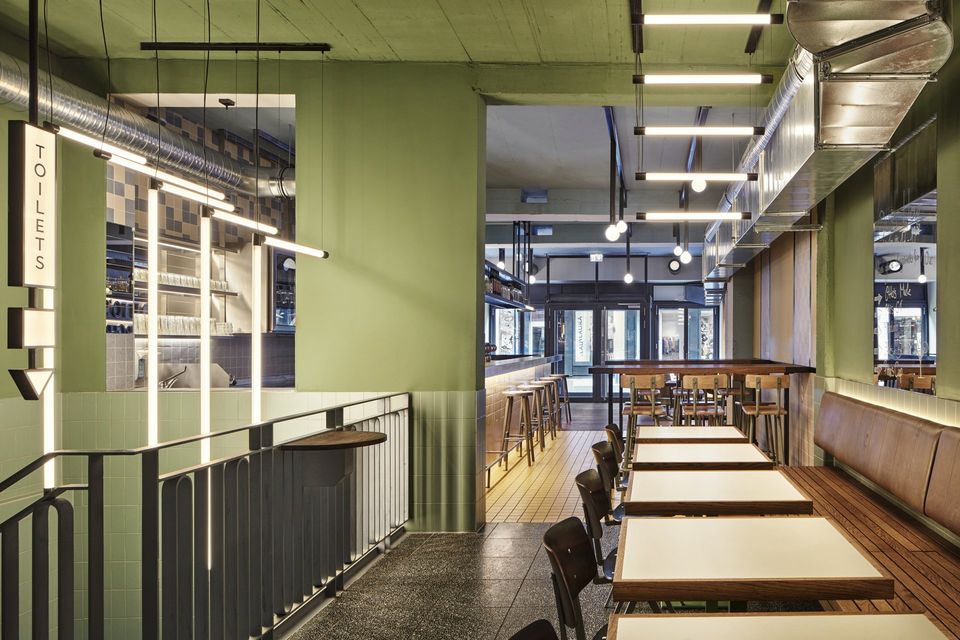
The informality of Otto’s logo is spread around the building: it is visible, not only through the transformation of its letters, but also through the juxtaposition of square and round profiles. This game is clearly recognizable in the bar area, where, square profile lights create the shape of a T. These hang from the ceiling beams and are suspended above high tables opposite of the bar, creating a visually separate dining area along with the wall tiled with different patterns.
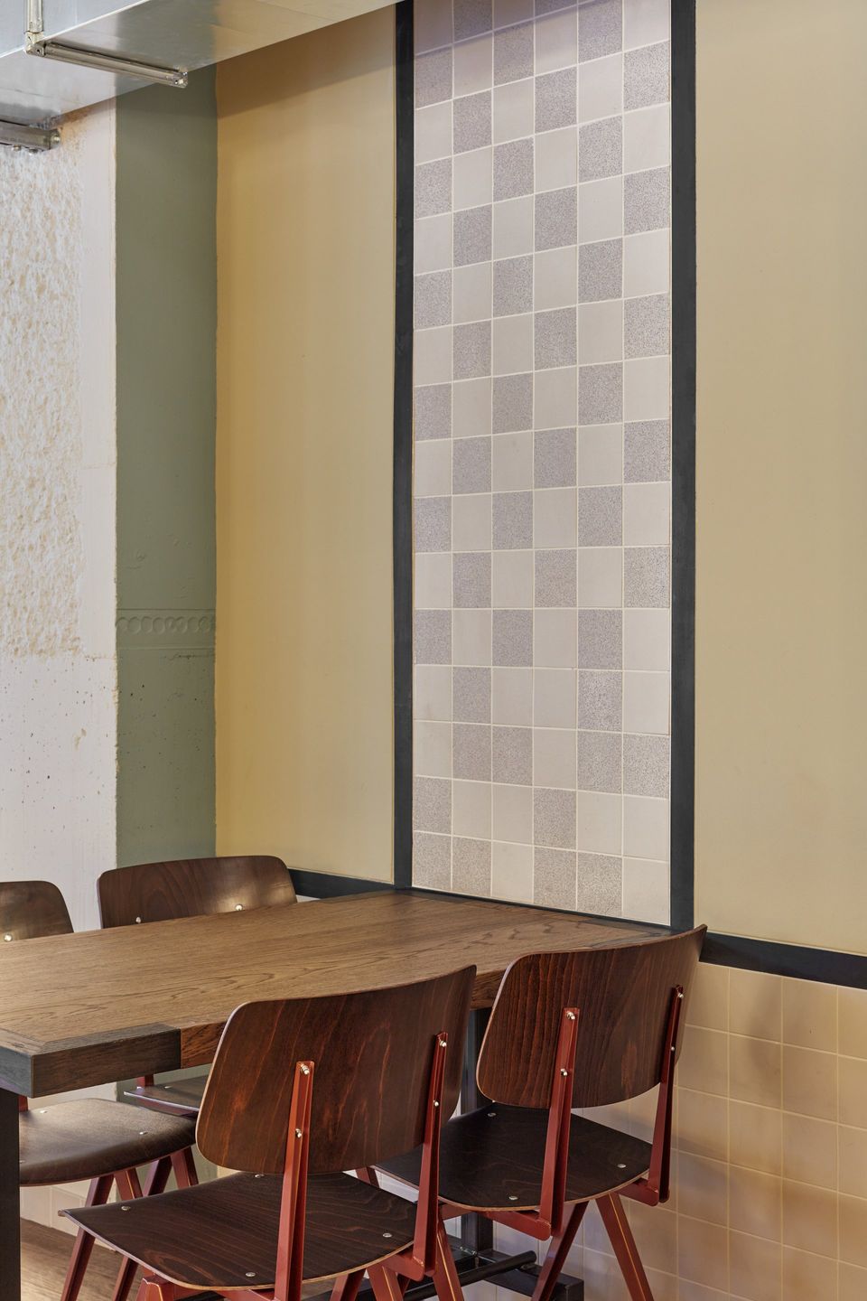
New materials are introduced into the space, giving quality and warmth, while the inspiration from the former bakery and Otto’s identity forms furniture pieces and special elements such as light fixtures and signage. Before the renovation, the tile pattern that used to fill the interior visibly showed the passing of time. Old and new tiles, with different sizes and colors laid side by side: a white and blue checkerboard standing next to a white lane of bigger tiles; broken L-shaped blue ones merging into black ones; terrazzo floor scattered within the building. The variety of colors, shapes and patterns inspired the new material palette.
Otto’s style effortlessly merges with the rich history of the space that flows throughout the whole restaurant. The four distinct areas of the building come together under a straightforward graphic language which fits perfectly with the identity of a burger restaurant. By turning this old bakery into the second Otto’s Burger outside of Hamburg, Studio Modijefsky’s new design invites you to take a break and enjoy a nice drink, or taste a delicious burger, surrounded by a fresh and welcoming vibe.
Photography by Maarten Willemstein
Address: Severinstraße 59, 50678 - Cologne, Germany
www.ottosburger.com
www.studiomodijefsky.nl
SHARE THIS
Latest Edition
Mar / Apr 2026 edition is available now!
Contribute
G&G _ Magazine is always looking for the creative talents of stylists, designers, photographers and writers from around the globe.
Find us on
Latest News
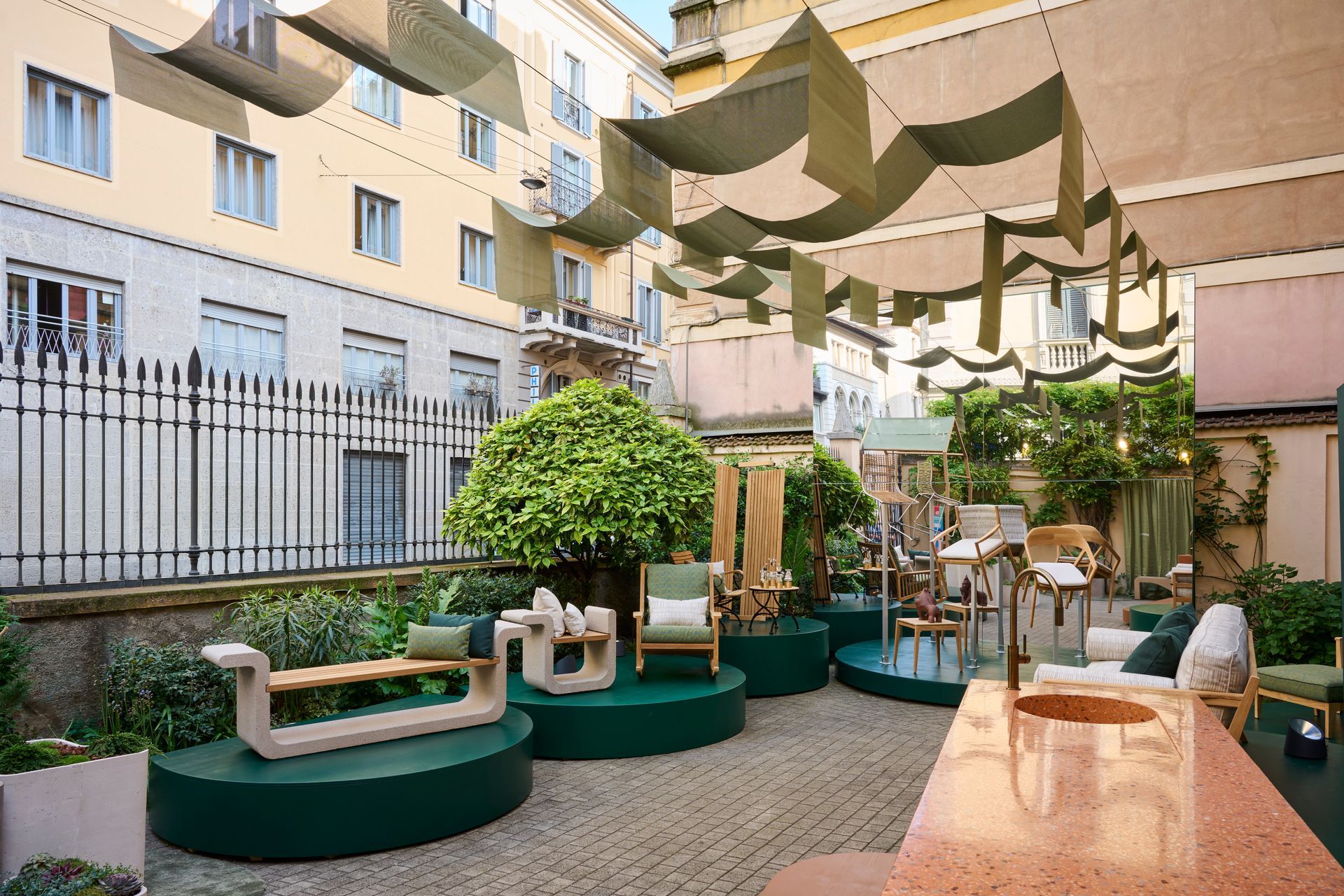
During Milan Design Week, where the city becomes an intricate map of overlapping visions and fleeting installations, Bodo Sperlein delivers a moment of rare coherence and depth with MENU exhibition that transcends the conventional boundaries of design to inhabit architecture as a living, breathing entity.
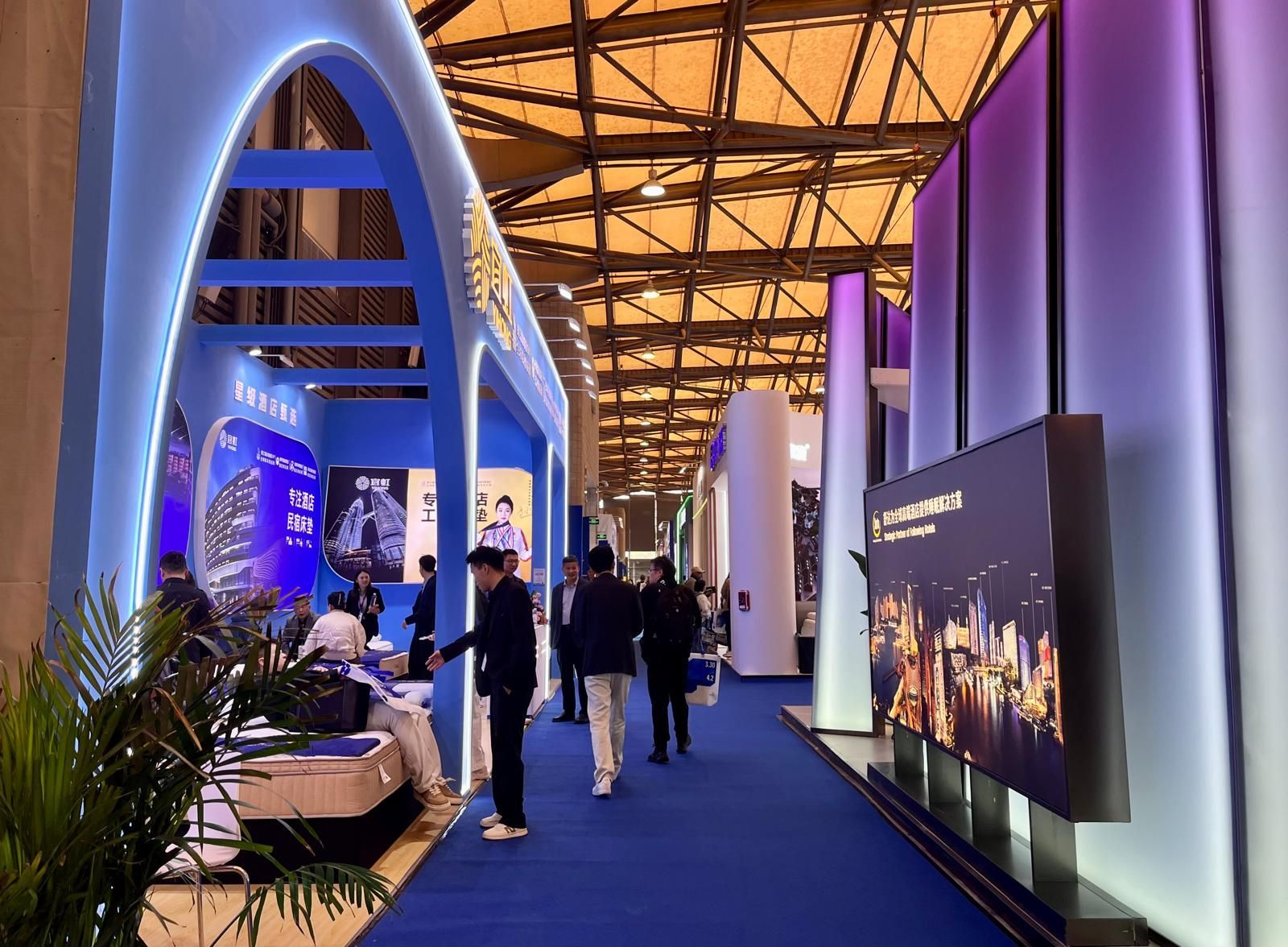
From March 31 to April 3, 2026, at the Shanghai New International Expo Centre, Hotel & Shop Plus 2026 Shanghai unfolded as far more than a trade fair: it emerged as a living, breathing platform where the very notion of travel dissolves, permeating every layer of contemporary lifestyle and spatial design.
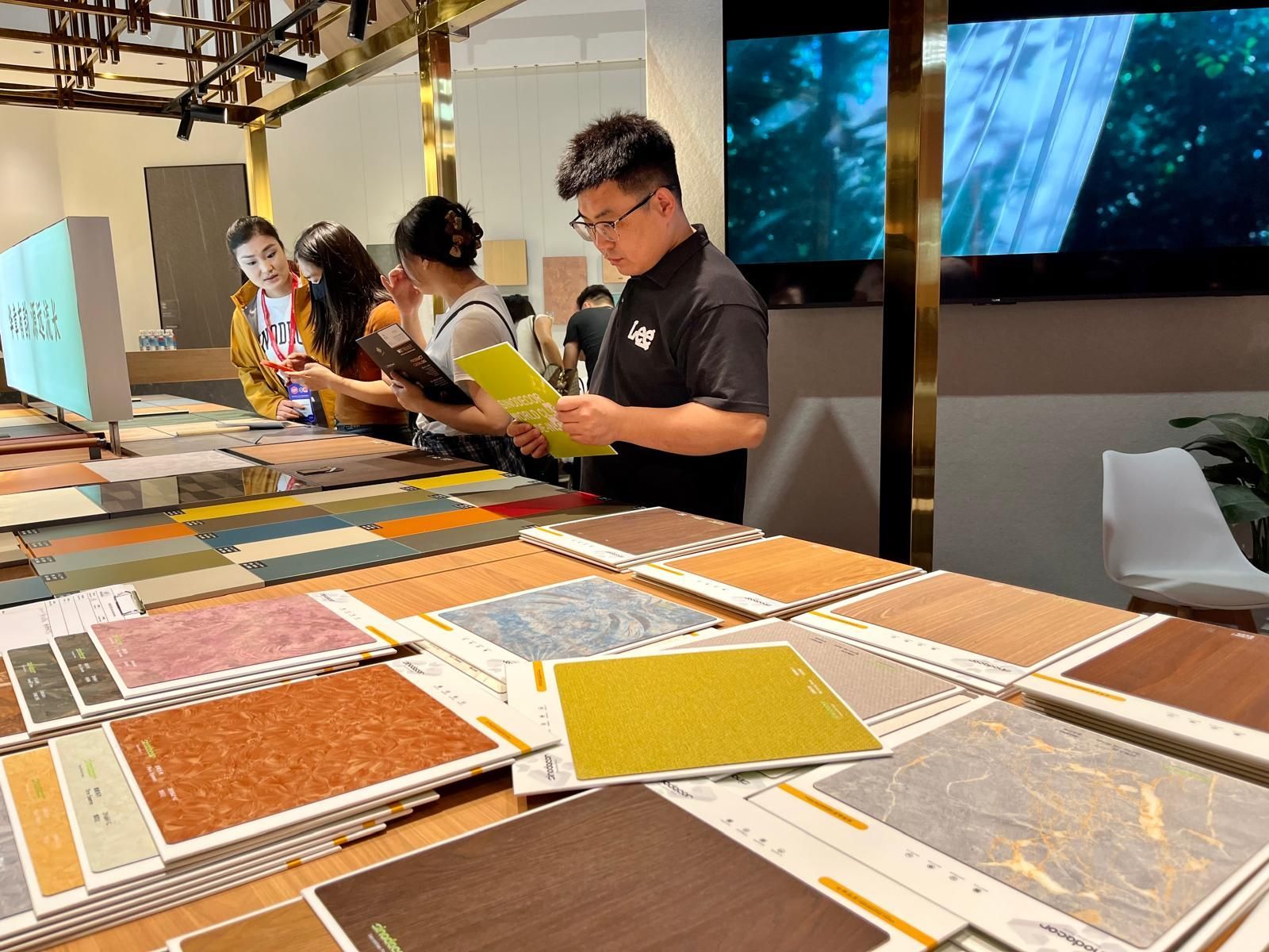
Held in two phases, from March 18–21 and March 28–31 at the Canton Fair Complex, the 57th edition of CIFF demonstrated how design is no longer something merely displayed but something to be fully experienced through the senses: deconstructed, re-engineered and ultimately redefined in its deepest essence: matter .
Clerkenwell Design Week (CDW) is pleased to announce it will be returning to London’s EC1 on the 19 – 21 May 2026. Marking the 15th anniversary of this global design festival, a new curated series of largescale installations will be launched called Design Interventions .
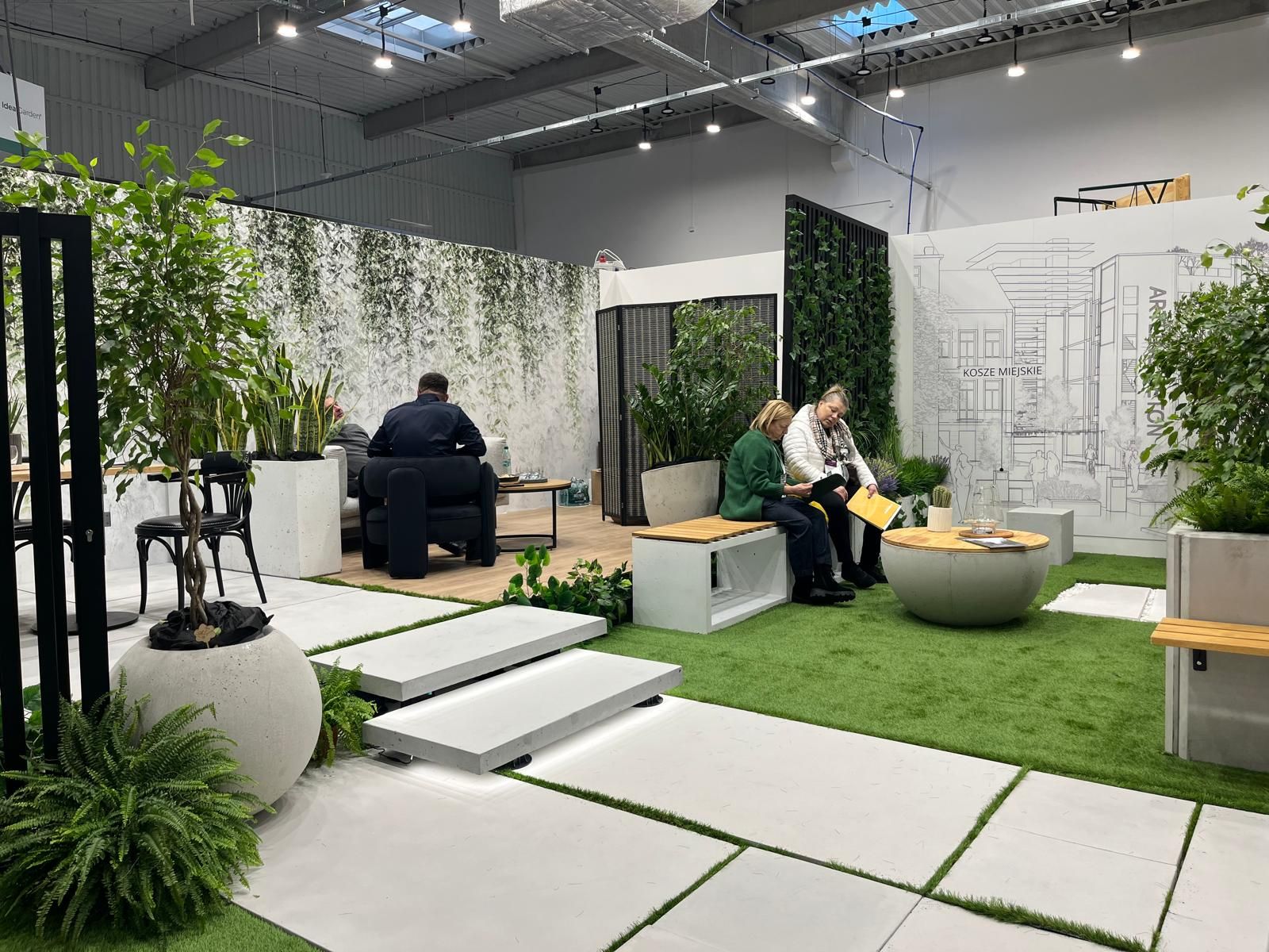
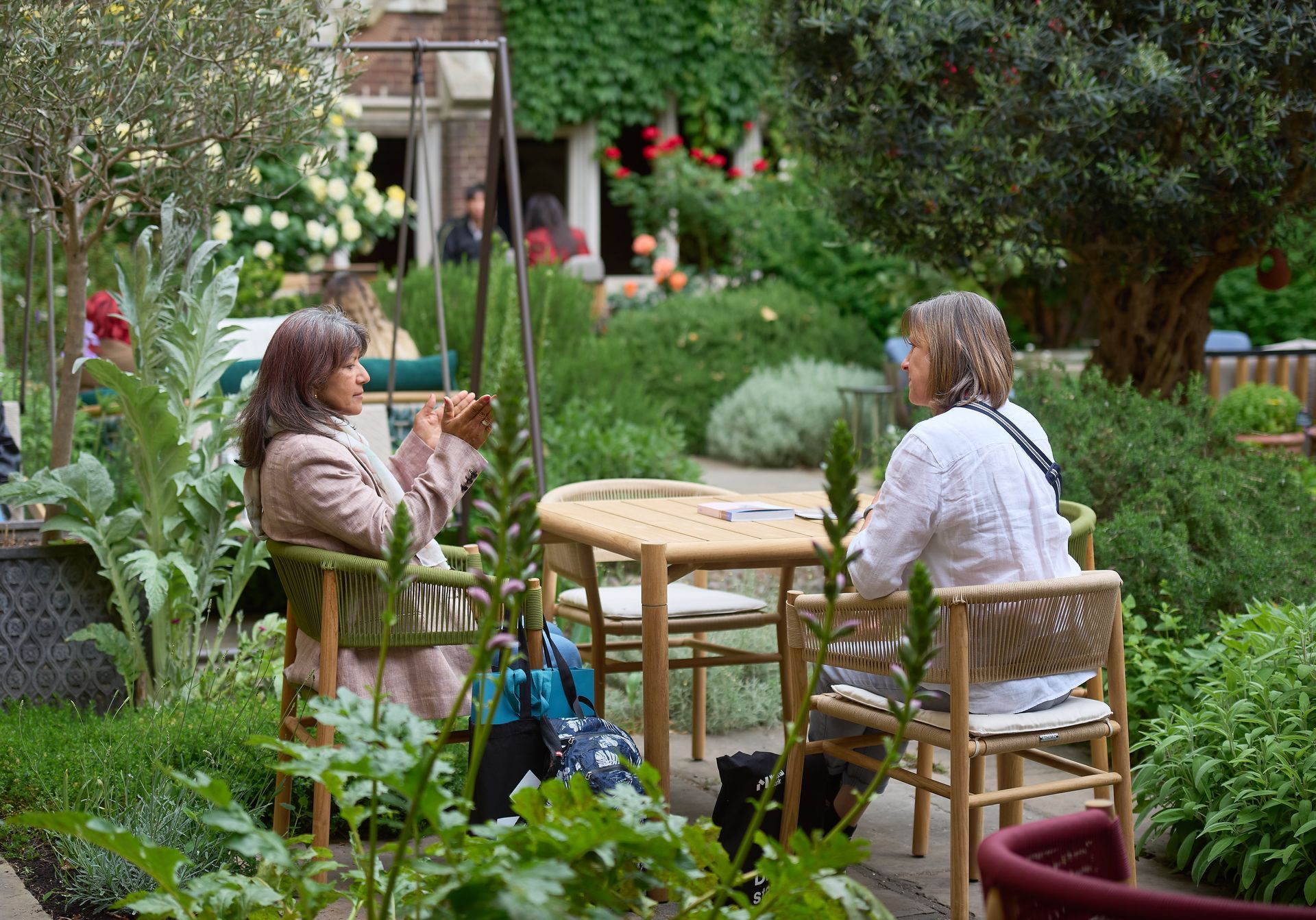
At a time when design is redefining its priorities, the contemporary landscape of interiors, décor, and outdoor living is clearly shifting from a digital-centric vision toward a more human, emotional and nature-driven approach. This transition was strongly evident during the latest editions of Warsaw Garden Expo and Warsaw Gift & Deco Show , held at Ptak Warsaw Expo from 10th to 12th February 2026.
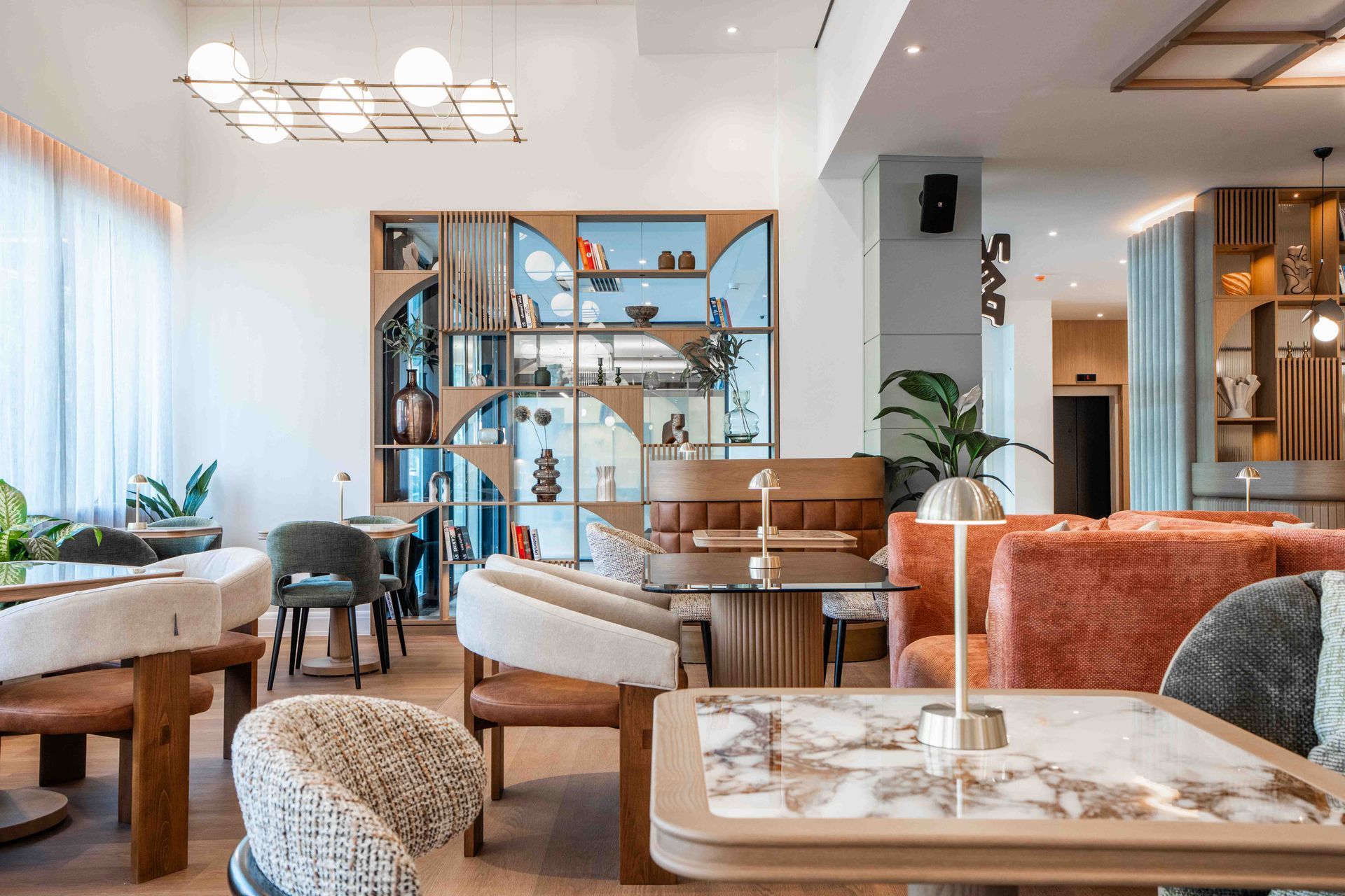
Merav Bustan, founder of the Berlin-based design studio bearing her name, is the creative force behind the interior design of the new boutique hotel, VIA Antwerp , located in the vibrant heart of the Zurenborg district.
Subscribe
Keep up to date with the latest trends!
Popular Posts
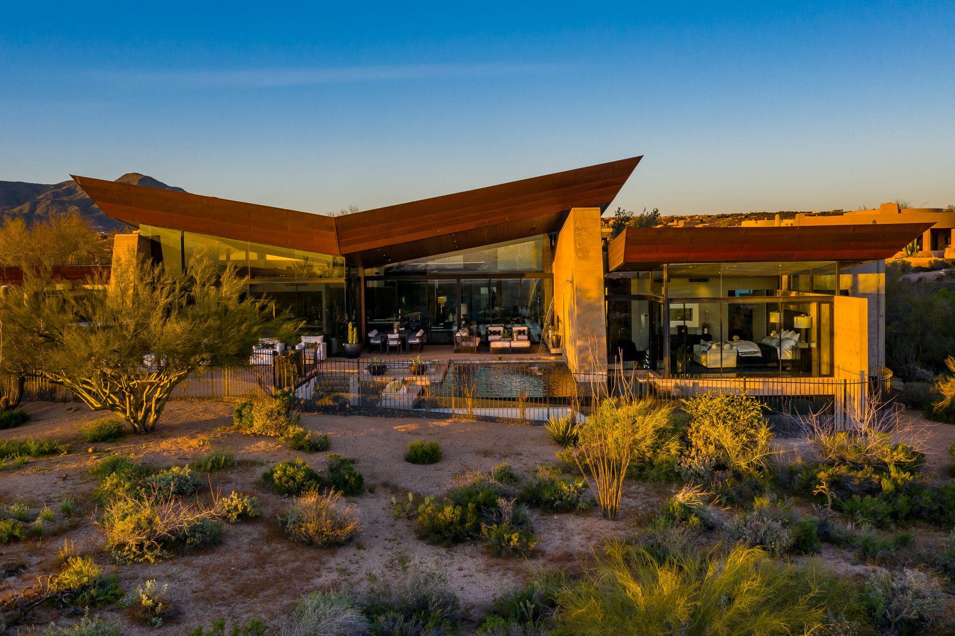
Recognized for its unique ability to create emotionally resonant spaces that are as visually striking as they are functionally intelligent, JAQUE has been nam ed Best Luxury Interior Design Studio in Arizona by the Luxury Lifestyle Awards in 2025.
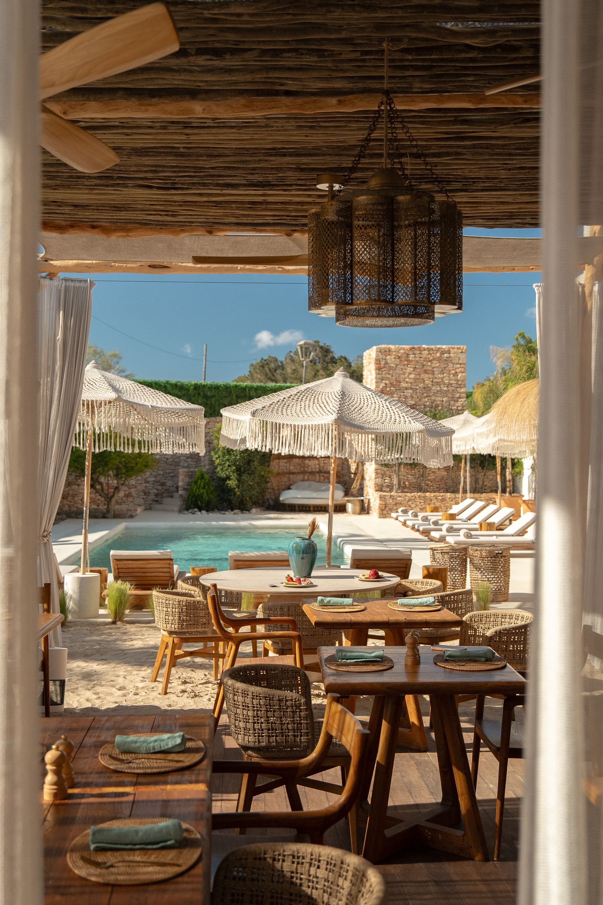
A soft, luxurious atmosphere permeates every corner of the hotel, which embodies the spirit of the island through curated décor, thoughtful design, and immersive experiences. Mar Suites Formentera is a refined retreat where guests feel deeply connected to the surrounding landscape and to a slower way of living.

At M&O September 2025 edition, countless brands and design talents unveiled extraordinary innovations. Yet, among the many remarkable presences, some stood out in a truly distinctive way. G&G _ Magazine is proud to present a curated selection of 21 Outstanding Professionals who are redefining the meaning of Craftsmanship in their own unique manner, blending tradition with contemporary visions and eco-conscious approaches.