
Salone del Mobile.Milano - the new interpretations
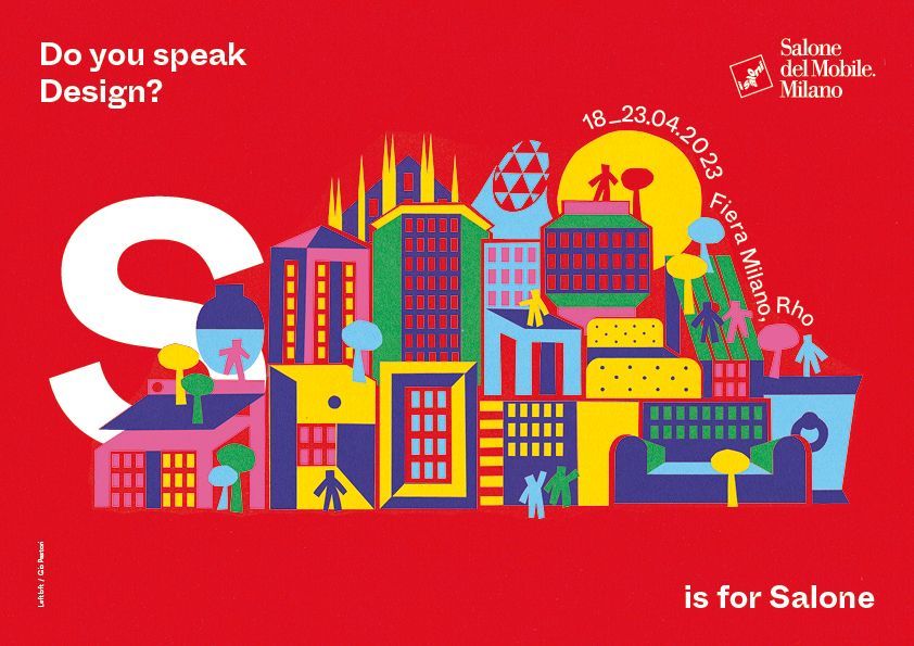
Salone del Mobile.Milano presents the interpretation for its letters: “S” is for Salone and “M” is for Milan, reinvented by Leftloft and reinterpreted by Gio Pastori.
PH Andrea Mariani
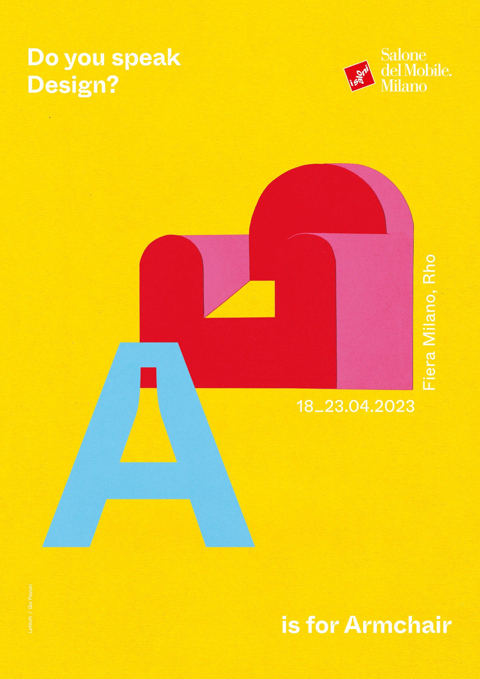
The new design alphabet consists of 26 brightly coloured posters: one for each letter of the alphabet, each featuring an archetypally-shaped furnishing piece, narrating the Salone and the objects around which the international design system evolved.
A Munari-style ABC, composed of absolute forms and brought alive by the use of light and pure, intense shades, responding to the question “Do you speak design?” with A is for armchair, B is for bookcase, C is for chair, D is for Desk, G is for Gazebo, L is for Lamp, O is for Outdoor, P is for Pouf, T is for Table.
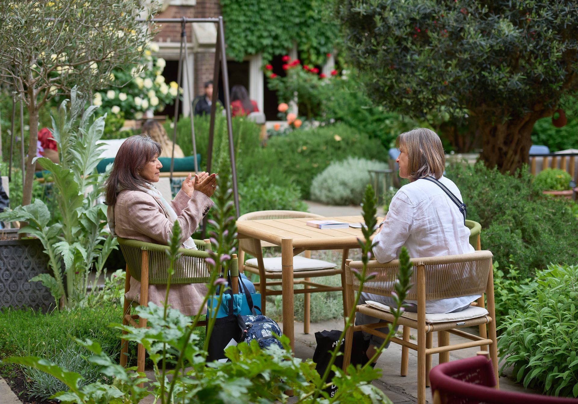
In this particular alphabet, the letters “M” and “S” dovetail naturally with the Mirror and Sofa icons. Until now, that is. In two entirely new, vibrant and joyous posters, these monograms take on new attributes. In April, “M” means Milan, the design city par excellence, and “S” stands for Salone, the Italian headword that is synonymous with design the world over. The accompanying visuals narrate an extraordinarily brightly coloured, happy city, giving off a sense of joie de vivre built on travel, stimulation and inspiration, in which iconic design objects feel at home and jostle to invent a new skyline that seems to explode with energy, forms, geometries and buzz.


The poster for Euroluce, on the other hand, alludes with a simple yet potent visual reference to the new experience lying in wait for visitors and exhibitors at the exhibition. The biennale space works as an entirely new magical, luminescent wrapper which, having gathered in all the light in the world, opens out bit by bit as if to invite visitors inside to discover not just the technical, design-related and commercial side of the exhibition but, above all, the emotional charge bound up with this absolutely crucial element in design and architecture. Reimagine Your Light Experience gives a clear indication of the new all-round Euroluce experience, with inspirational and generative moments making those visiting its pavilions feel as though they are on a multi-sensory and engaging journey in search of previously unseen and evocative spatial meanings.
Discover more on
SALONEMILANO.IT
SHARE THIS
Latest Edition
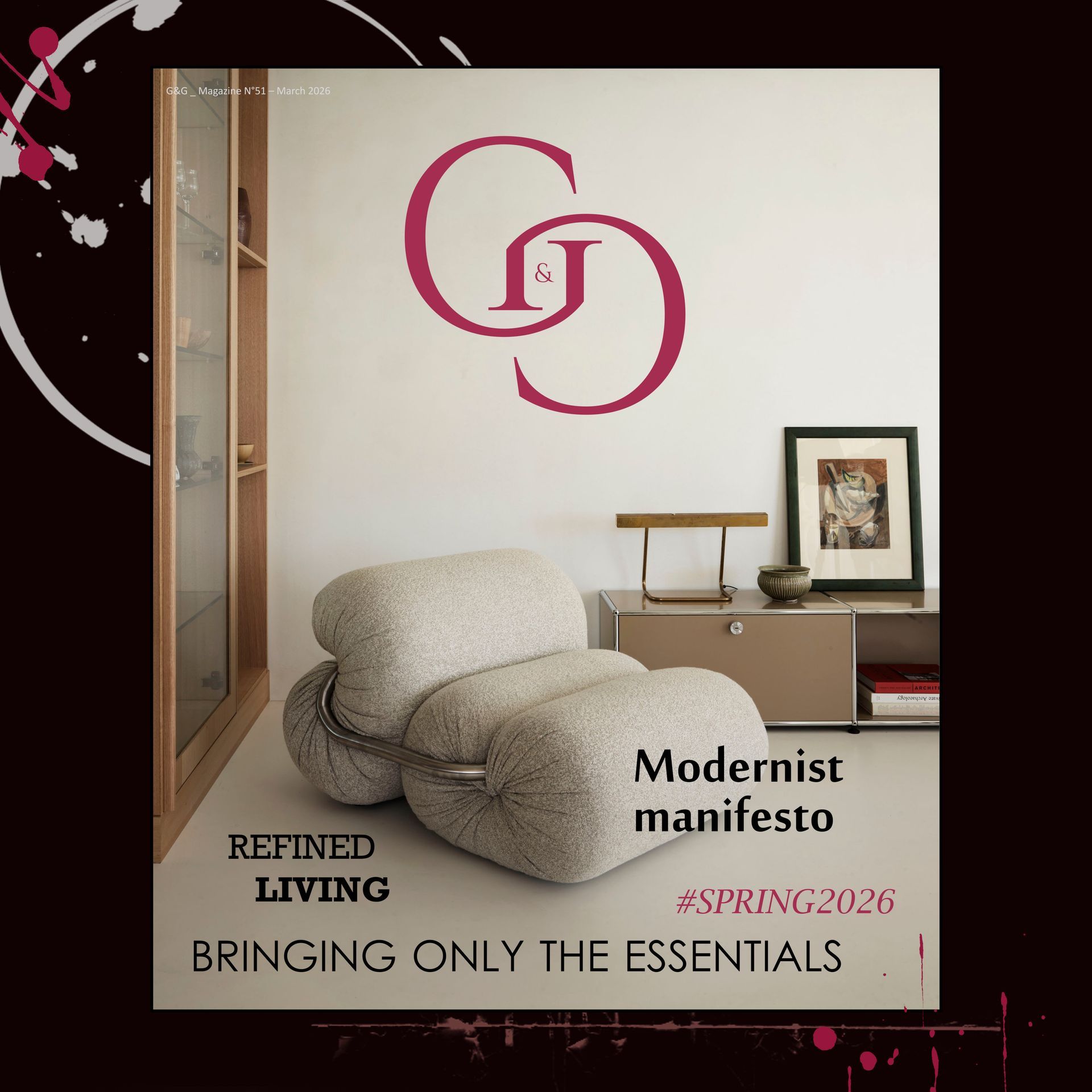
Mar / Apr 2026 edition is available now!
Contribute
G&G _ Magazine is always looking for the creative talents of stylists, designers, photographers and writers from around the globe.
Find us on
Latest News
Subscribe
Keep up to date with the latest trends!
Popular Posts